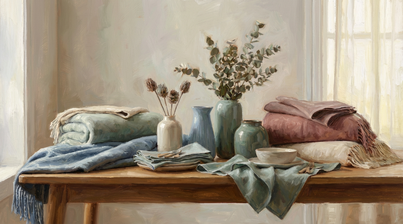
Color can whisper or shout. It can calm the eye or keep it restless. When colors work together, a painting feels complete, even if the viewer cannot explain why. When they clash, something feels wrong, no matter how skilled the drawing is. That invisible difference often comes down to harmonious color schemes.
Harmony in color is not about using pretty combinations. It is about relationships. Colors need to belong to each other, like instruments in an orchestra. Each one plays a role. None should overpower without purpose.
This article explores how to create harmonious color schemes in your artwork with confidence. You will learn how to choose, adjust, and balance colors so they feel intentional rather than accidental.
Why Harmonious Color Schemes Matter in Art
A painting communicates before it explains. Color delivers the first message.
When harmonious color schemes are present, the viewer relaxes. The eye moves comfortably. The artwork feels resolved.
Without harmony, even strong ideas struggle. Tension may appear unintentionally. Focus scatters. Mood becomes unclear.
Harmony does not mean boring. It means controlled. Once control exists, contrast and drama become tools rather than problems.
Understanding Color Relationships Before Rules
Many artists memorize color rules. However, harmony comes from understanding relationships.
Colors interact. They influence each other’s brightness, warmth, and intensity. A red beside green feels stronger than red beside orange.
Harmonious color schemes grow from awareness of these interactions. Instead of choosing colors in isolation, you consider how they behave together.
This mindset shifts color from decoration to structure.
The Role of the Color Wheel in Harmony
The color wheel offers a useful map. It shows relationships clearly.
Adjacent colors share harmony naturally. Opposite colors create contrast. Triads balance energy.
Still, the wheel is a guide, not a command. Harmony depends on proportion, value, and saturation as much as hue.
Use the color wheel to understand options. Then trust your eye to refine choices.
Harmonious Color Schemes Start with Limited Palettes
Limitation encourages unity.
When you use fewer colors, relationships strengthen. Repetition increases cohesion. Mixing becomes intentional.
Many harmonious color schemes rely on three to five main colors. Variations come from mixing rather than adding.
This approach reduces chaos. It also speeds decision-making.
Using Analogous Colors for Natural Harmony
Analogous colors sit next to each other on the color wheel.
These combinations feel natural and calm. They appear often in landscapes and organic subjects.
Because they share undertones, analogous colors blend smoothly. Harmony emerges almost automatically.
To avoid dullness, vary value and saturation. Contrast still matters, even in gentle schemes.
Complementary Colors and Controlled Contrast
Complementary colors sit opposite each other. They create energy.
Used carelessly, they clash. Used thoughtfully, they create powerful harmony.
The key lies in dominance. Let one color lead. Let the other support.
Muting one complement often improves balance. Harmony grows when contrast feels intentional rather than equal.
Split Complementary Schemes for Softer Balance
Split complements offer contrast without aggression.
Instead of direct opposites, you use colors adjacent to the complement. This reduces tension while maintaining interest.
Many harmonious color schemes rely on this structure because it feels balanced yet dynamic.
This approach suits expressive work that still needs unity.
Triadic Color Schemes and Visual Energy
Triadic schemes use three evenly spaced colors on the wheel.
They create vibrancy and balance simultaneously. However, control remains essential.
Let one color dominate. Use the others as accents. Adjust saturation carefully.
Harmony emerges through hierarchy rather than equality.
The Importance of Value in Color Harmony
Value often matters more than hue.
Even clashing colors feel harmonious if their values align well. Conversely, perfect color choices fail when values conflict.
Check your artwork in grayscale. Does it still read clearly? If yes, harmony likely exists.
Strong value structure supports any color scheme.
Using Saturation to Control Harmony
Saturation controls intensity.
Highly saturated colors demand attention. Muted colors support quietly.
Harmonious color schemes often mix both. Too much saturation overwhelms. Too little feels lifeless.
Use saturation intentionally to guide focus and mood.
Warm and Cool Balance in Color Schemes
Temperature shapes atmosphere.
Warm colors advance. Cool colors recede. Balance creates depth.
Many harmonious color schemes rely on warm accents within cool environments or vice versa.
Temperature contrast adds interest without breaking unity.
Creating Harmony Through Color Repetition
Repetition builds cohesion.
When a color appears in multiple areas, the painting feels connected. Even small echoes matter.
Repeating colors in shadows, highlights, or reflections strengthens unity subtly.
Harmony often hides in these quiet repetitions.
Neutral Colors as Harmonizing Agents
Neutrals hold everything together.
Grays, browns, and muted tones allow brighter colors to breathe. They reduce competition.
Using neutrals between strong colors softens transitions. Harmony improves instantly.
Mix neutrals from existing colors to maintain unity.
Harmonious Color Schemes and Mood
Color sets emotional tone.
Soft harmonies feel calm. Strong contrasts feel energetic. Muted palettes feel reflective.
Choose colors based on desired mood, not just visual appeal.
Harmony supports emotional clarity. The message becomes stronger.
Lighting and Its Effect on Color Harmony
Light changes everything.
Warm light shifts colors warmer. Cool light does the opposite. Ignoring light breaks harmony.
Observe light source carefully. Adjust color choices accordingly.
Harmonious color schemes always account for lighting conditions.
Using Reference to Study Harmony
Nature teaches harmony constantly.
Study photos, master paintings, and real scenes. Notice how colors relate rather than copy them.
Ask what dominates. Ask what supports. Patterns emerge quickly.
Observation sharpens instinct.
Avoiding Too Many Colors
More colors do not equal better results.
Too many hues fragment harmony. Focus scatters.
Limit new colors unless necessary. Mix instead.
Harmonious color schemes value restraint over abundance.
Adjusting Colors Instead of Replacing Them
When harmony fails, adjustment often works better than replacement.
Shift value. Reduce saturation. Warm or cool slightly.
Small changes restore balance faster than starting over.
This flexibility builds confidence with color.
Color Harmony Across Different Mediums
Medium affects color behavior.
Oils blend smoothly. Acrylics dry darker. Watercolors rely on transparency.
Adjust expectations based on medium. Harmony principles remain, but execution shifts.
Understanding medium behavior supports better color control.
Using Background Colors to Unify Foreground Elements
Background influences everything.
A harmonious background ties disparate elements together. It provides context.
Adjusting background color often fixes foreground issues.
Think of background as the glue of the painting.
Personal Color Preferences and Harmony
Every artist has preferences.
Some lean warm. Others favor cool. These tendencies shape style.
Lean into preferences intentionally. Consistency builds recognizable harmony.
Personal harmony feels authentic rather than forced.
Building Color Harmony Through Series Work
Series work strengthens understanding.
Repeating themes allows refinement. Harmony becomes clearer with repetition.
Mistakes inform future choices. Growth accelerates.
Series reveal patterns you might miss otherwise.
Training Your Eye for Harmonious Color Schemes
Harmony improves through practice.
Mix color studies. Limit palettes intentionally. Analyze outcomes.
Over time, intuition develops. Decisions become faster.
Training replaces guesswork with confidence.
Knowing When Disharmony Is Intentional
Not all disharmony is bad.
Sometimes tension supports concept. Discomfort can communicate meaning.
Intent separates expressive tension from accidental chaos.
Break harmony knowingly, not accidentally.
Conclusion
Harmonious color schemes are not about rigid formulas. They are about relationships, balance, and intention. When colors support each other, artwork feels resolved and confident. The viewer senses unity even without understanding why.
Harmony grows through observation, limitation, and thoughtful adjustment. With practice, color choices feel less stressful and more expressive. Over time, harmony becomes instinctive. Color stops fighting you and starts working with you. That partnership transforms artwork quietly but powerfully.
FAQ
1. Do harmonious color schemes limit creativity?
No, they provide structure that supports stronger expression.
2. How many colors should a harmonious scheme use?
Often three to five main colors work well.
3. Can bright colors still be harmonious?
Yes, when balanced with value, saturation, and proportion.
4. Is the color wheel required for harmony?
It helps, but observation and adjustment matter more.
5. How long does it take to learn color harmony?
It develops gradually through practice and awareness.
Favorites
Human Written |100% Unique |SEO Optimised Articleby Jumma
Keyword Strategyby AIPRM
Generate Buyer Personaby Contact For SEO
SEO Meta title and Meta Descriptionby Hussain Silat
Create a full website of:by Diego Alfeiran
Creative Logo Designby Leandro Wanderley
SEO Article Prompt for Agency (BBP)by Ian Manalo
Custom Lists
SEO Article Prompt for HistoryOfBitcoinby Ian Manalo
SEO Article Prompt for BitcoinMinerSalesby Ian Manalo
Own
Article SEO Prompt for Cornerstone Pagesby Ian Manalo