
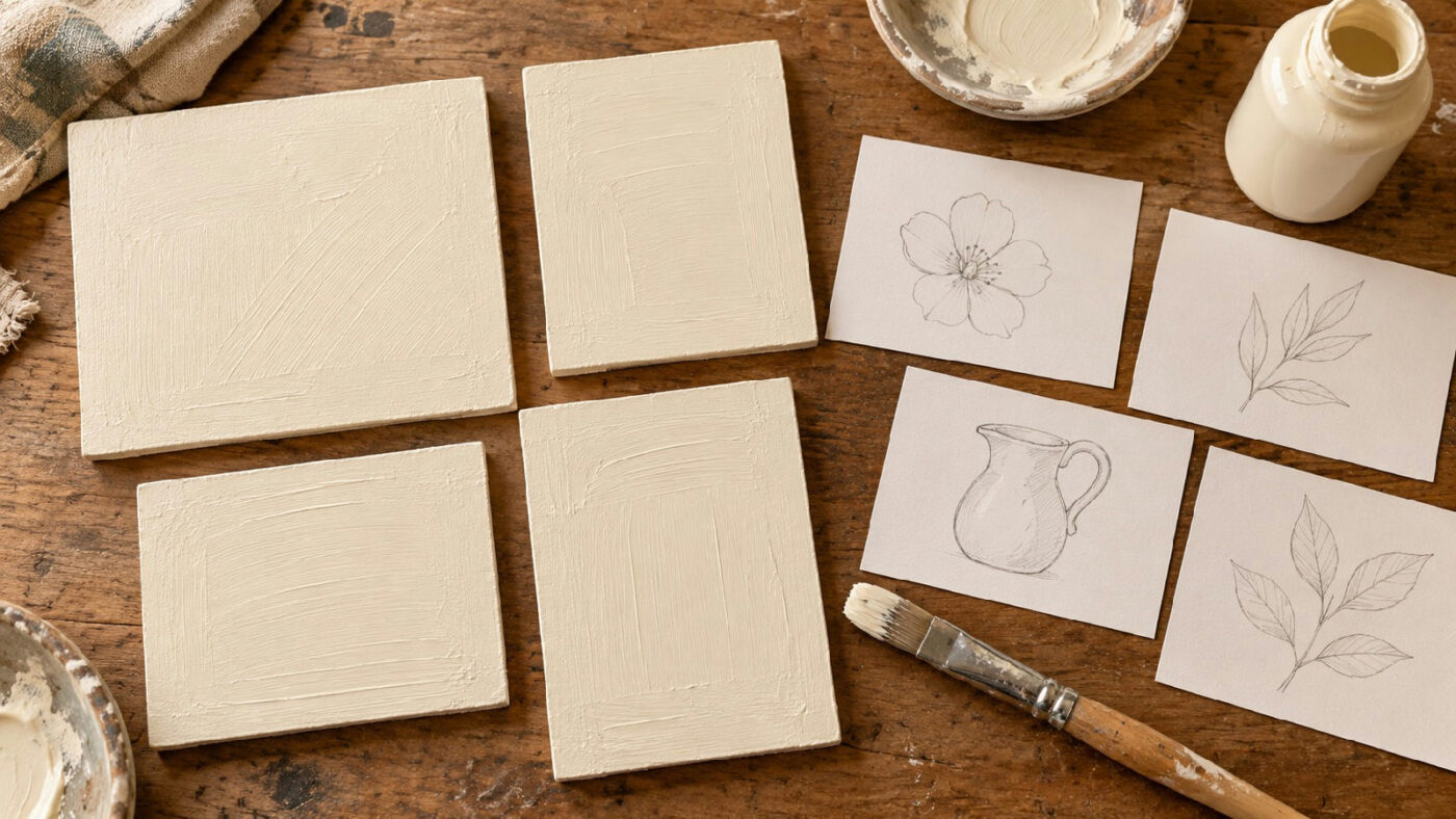

Let’s talk about a calm way to look at a painted practice surface before reaching for more paint. A pale patch, a raised brush track and a deliberate texture are three different things, and if you treat them all as “needs another coat,” you may lose the finish you actually wanted. This little card helps you name what you see and choose one clear next step.
Use a spare piece prepared the same way as your decorative project. This is an observation habit, not a manufacturer’s coverage guarantee, so follow the directions on the paint and surface products you actually use. Our materials section has other starting points; here we’ll build a small record connecting the finish you want with the dried result in front of you.
Write down the finish you are aiming for
Before judging the sample, describe what you want. An even plain background for a small floral design is a different target from a visibly brushed backdrop. Choose ordinary words such as even color, quiet texture or intentionally visible brushwork. You do not need a technical specification to make the comparison useful.
Put that description at the top of the card. If you skip it, an attractive example from another project can become your standard halfway through the exercise. Keeping your own aim in view helps you avoid changing the finish simply because a different one catches your attention.
Also record the project area the sample represents. A lid, a flat plaque and a curved side may expose different parts of the brushwork to view. This exercise concerns the sample you made; it does not establish how the same coating will behave on every object in the room.
Keep the material record short but specific
Write the paint name, color name, surface and preparation used. Include any medium or dilution you deliberately added, following the applicable product directions. Record what you actually did instead of describing the mixture as normal or standard. Those words will not help you compare a later attempt.
If you are using FolkArt Matte, Plaid’s own application guidance calls for thin, even coats and drying between layers. Keep that instruction attached to that product. Do not assume it supplies a drying time or coating method for another paint.
Leave space for the date and the number of completed passes. The record can fit on an index card. Its purpose is to explain the sample beside it, so avoid a long inventory of tools you never used or a list of possible materials for a future project.
Inspect a dried sample at a normal viewing distance
Let the sample reach the condition specified for inspection in the relevant directions. Do not use a wet surface to decide whether its dried appearance meets your plan. If the label distinguishes drying from curing, preserve that distinction in your notes rather than inventing one convenient waiting period.
Start at the distance from which the object would usually be seen. Look for the broad impression: whether the background appears even enough for your design, whether the color supports the planned motif and whether an obvious patch distracts you. Write the observation before moving closer.
Then examine the surface more closely. This second look helps you locate the issue, but it should not automatically overrule the first. A tiny irregularity that will sit beneath a painted motif may matter less than a broad uneven area left visible around the design.
Separate color coverage from surface texture
Make two columns labeled color and texture. Under color, note what appears darker, lighter or uneven. Under texture, describe ridges, stippling or other visible surface marks. Avoid writing bad coverage when the only thing you have noticed is a brush track.
If you cannot tell whether a patch is color or texture, change your viewing position and look again. Record the uncertainty if it remains. A simple question mark is more useful than confidently labeling a problem you have not identified.
Keep the sample in the same orientation as the planned object when practical. Mark its top on the back. This lets you return to the observation without wondering whether you rotated the piece or examined a different area. Your card should make the comparison repeatable, not merely collect impressions.
Mark only the areas you need to discuss
Sketch a small outline of the sample on the card and label a few locations. For example, A can mark the center patch and B the lower edge. Keep marks on the card rather than drawing over the painted surface you are trying to inspect.
Write a short description beside each letter. “Lighter near lower edge” is clearer than “needs work.” “Raised line at center” distinguishes a surface observation from a color one. These plain descriptions let you decide what to try without pretending you know the cause yet.
A photograph may help you remember the arrangement, but use the physical sample for the decision whenever you can. Lighting and camera processing can change how a surface appears. If you take a picture, note that it is a record of that view, not proof of a precise color match.
Choose one small comparison to make next
Decide whether you need another sample, a change in application or no further action. Choose one variable for a comparison instead of changing paint, preparation, brush and technique together. With several simultaneous changes, you may like the new result but have little idea which decision mattered.
For a product that directs another thin coat, a comparison might be the existing sample beside a separate sample with that additional coat, prepared according to the same instructions. If the problem concerns texture, the useful next step may be a practice application on spare material.
Do not treat the card as permission to sand, strip or apply an incompatible product. Those are material decisions that require the relevant instructions. When the sample raises a compatibility question, write the question and consult the manufacturer rather than converting an appearance check into a repair experiment.
Use the basecoat inspection card for a clear decision
At the bottom, write one of three practical outcomes: ready for the planned decoration, make a comparison sample or ask a material question. Add a sentence explaining the choice. This turns observation into a useful next action while leaving room for uncertainty.
If the background serves the design, say so and move on. A practice surface does not need to become an endless polishing project. The point is to decide whether it supports the decoration you intend to paint, within the requirements of your materials.
If you need another sample, describe the single change before beginning it. A note such as “same preparation, compare one additional label-directed coat” gives the next session a starting point. Avoid writing “try everything again,” which leaves you to repeat the same decision process.
Check the decision against the planned motif
Place a paper version of your intended decoration beside the sample. Ask whether the background observation changes where that motif should sit. A quiet patch in the center may be covered, while the visible edge remains uneven. Keep those two areas separate in the decision. This comparison does not replace material preparation requirements; it helps you spend your practice time on the part of the finish the completed design will actually show.
Keep successful and unsuccessful samples together
Store the card beside the sample or attach a matching identifier to their backs. Do not keep a pleasing piece while discarding the notes that explain it. An attractive result is much easier to revisit when you know which materials and application you used.
Keep one instructive comparison as well, if space allows. It can remind you why you selected the final approach. Label it plainly so you do not later mistake an abandoned test for the approved background.
When the main project is ready, consult the chosen sample and its decision. Check that you are using the same relevant materials and preparation. A basecoat inspection card earns its place by helping you make a specific choice, finish the practice and begin the decoration with a clearer understanding of the surface in front of you. What does your own practice board tell you right now? Happy painting.