
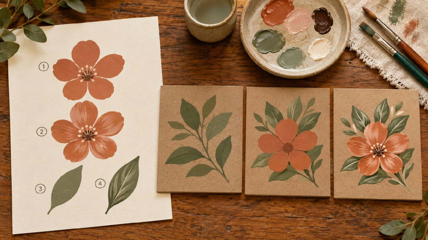

Let’s turn a decorative design into a sequence you can actually follow at the painting table. A layer order map shows which shapes sit behind others, where an edge stays visible and which details depend on an earlier pass. It’s a useful habit when a simple sketch looks clear on paper but leaves you hesitating over the first brushstroke on the prepared object.
Use an original small design with a few overlapping shapes. The map records your intended order; it does not decide paint compatibility or drying requirements, so read the directions for your actual materials before applying them. Our style section has other project ideas, while here we’ll turn one chosen drawing into a workable sequence.
Choose a design with visible overlaps
Draw a modest arrangement such as a flower in front of two leaves, a ribbon across a circle or a simple branch behind a fruit shape. You need enough overlap to make the order matter, but not so many elements that the map becomes harder to read than the painting.
Keep the exercise on a practice surface before using a valued object. You can change the design while learning how to describe it. The goal is to make the order clear, not to complete a large decorative scene in one sitting.
Decide which part should appear nearest the viewer. Mark that choice on the drawing. Without an intended relationship, you may keep revising the sequence because the composition itself has not yet settled.
Identify the visible boundaries
Look at each place where one shape meets another. Ask which outline continues and which appears to stop behind its neighbor. Trace those boundaries on a paper copy if it helps you see the relationship.
Distinguish a real overlap from two shapes placed side by side. Neighboring forms may need careful edges, but they do not necessarily require the same painting sequence as one form covering another. Mark them differently so the map does not invent a depth relationship.
Where the drawing is ambiguous, resolve it now. You might move a leaf, open a small gap or simplify an intersection. A confusing pencil sketch will not become easier to follow just because paint is involved.
Name the passes in ordinary language
Give each pass a short name such as background, rear leaves, flower shape and center detail. These labels describe the task more clearly than a series of unexplained numbers. Add numbers only after the names make sense.
Separate the broad shape from its later detail if they need different work. For example, filling a flower silhouette and adding fine petal marks can occupy separate stages. This does not mean every stroke requires its own line on the map.
Avoid technical terms you do not use comfortably. The plan is for your next session, so it should be readable when your hands are occupied and your attention is on the object. A plain label is often the most useful one.
Put material requirements beside the sequence
Read the relevant application guidance before deciding when one pass can follow another. A color appearing behind another in the drawing does not establish that the next paint can immediately be applied over it. The visual plan and the material plan need to agree.
For example, GOLDEN’s OPEN Acrylic Colors guidance describes thin layers and the possibility of reactivating recently worked paint. If using that line, consult its full directions for your application. Do not transfer a timing assumption from a conventional acrylic exercise to a slow-drying product.
Write the specific instruction you need to remember, or point to the source. Avoid inventing a universal number of minutes between passes. If a question about layering remains unresolved, keep the map as a paper plan until you have the manufacturer’s answer.
Build the layer order map from back to front
Start with the broad background if the design requires one. Then consider the forms intended to sit behind the others. Continue toward the nearer shapes and finally the small accents. This is a planning approach for this exercise, not a rule for every painting method.
Check each step against the visible boundaries. If a later flower covers the tip of a leaf, note where the leaf disappears. You can then decide what needs painting and what will be concealed, rather than spending time polishing an area that the design hides.
Keep the paper sketch alongside the numbered list. A sequence without its drawing can be difficult to interpret when you return to it. The two records should answer different questions: what belongs where, and what you intend to do next.
Mark the edges that need another look
Circle a few intersections that may be awkward to paint. Perhaps a ribbon crosses a narrow stem, or two nearby petals create a cramped opening. These are places for a small practice test before completing the main design.
Do not circle every edge. Choose the points that genuinely affect your sequence. Too many warning marks make the entire drawing feel difficult and obscure the small decision that would help most.
At each marked intersection, write what you want to find out. “Can I keep the ribbon edge clear?” asks a practical question. “Make it perfect” provides no information about what to observe or how to choose a next step.
Try one intersection on spare material
Paint a small sample containing the relevant shapes in your planned order, following the material directions. Keep the scale close enough to the project that the comparison means something. A large practice flower may not reveal the difficulty of a tiny crossing.
Observe whether the sequence helps you place the visible edges. If you change the order during the test, note that change immediately. Otherwise, the map will describe one method while the sample demonstrates another.
Do not use the exercise to infer adhesion, long-term durability or compatibility from appearance alone. It checks whether you can carry out the design sequence with the stated materials and instructions. Other material questions need their own evidence.
Decide where to pause the session
Add a pause after a stage that makes sense for the project and the product requirements. A clear stopping point helps if you cannot finish the whole design in one sitting. It also makes the restart easier to identify.
At that pause, write down what is complete and what remains. You might finish the main shapes and leave the fine accents for the next session. Mark the actual state instead of simply crossing off the day on a calendar.
If the project needs a waiting period, record the relevant condition or direction without shortening it to fit your schedule. Planning a decorative session around the material is more useful than forcing the material into an arbitrary timetable.
Keep revisions visible
When you change the composition, revise the map as well. A moved leaf can alter which edge is hidden and which pass needs to come first. Treat the plan as a working record rather than a promise that you may never adjust.
Keep the previous version if it explains an instructive sample. Label the chosen version clearly so you do not begin the object using an abandoned arrangement. A date or simple version number is enough.
If another person is joining the project, show them the drawing and sequence together. Ask whether they can identify the next pass without a long explanation. That check can reveal a missing label or a boundary that only makes sense in your head.
Return to the design with a clear next step
Before beginning the object, compare the materials, practice intersection and current drawing. Confirm that the plan refers to the version you intend to paint. Put the map where you can consult it without handling the wet project.
Follow the sequence while remaining attentive to what happens on the surface. If you need to stop and reconsider, update the record rather than continuing simply because the list says so. The map supports judgment; it does not replace it.
A layer order map is useful when it removes one recurring hesitation: which shape should come next. Once the overlaps, material requirements and stopping points are clear, you can spend more attention on placing the marks that make the design your own. What’s the trickiest overlap in your current project? Happy painting.