Using the best color mixing charts can dramatically improve your painting results. Many artists struggle with muddy tones and unpredictable blends. However, when you rely on structured guides, you gain clarity and control. As a result, your mixtures become cleaner and more vibrant.
The best color mixing charts provide a visual roadmap. Instead of guessing how pigments interact, you see outcomes in advance. Therefore, you reduce wasted paint and frustration.
Whether you work in oil, acrylic, or watercolor, understanding color relationships remains essential. With the right charts and guides, you build confidence and consistency in every project.
Why Color Mixing Charts Matter for Artists
Color theory may sound complex at first. However, practical tools simplify learning. Mixing charts translate theory into visible results.
When you create or study a chart, you observe how primary colors combine. You also notice how values shift when white or black enters the mixture. Consequently, patterns become easier to recognize.
Additionally, structured guides prevent random experimentation. Instead of guessing, you follow tested combinations.
The best color mixing charts allow you to predict secondary and tertiary hues accurately. Over time, prediction becomes instinctive.
Furthermore, charts help you identify pigment strengths and weaknesses. Some blues create vibrant greens. Others produce muted tones. Seeing these differences side by side accelerates understanding.
Types of Color Mixing Charts Every Artist Should Know
Different charts serve different purposes. Therefore, understanding options helps you choose wisely.
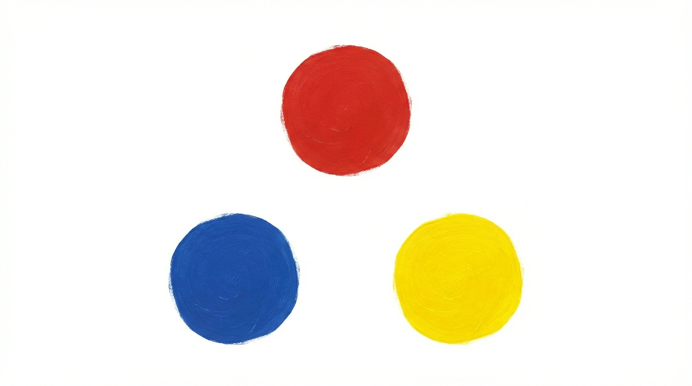
A primary mixing chart shows combinations of red, blue, and yellow. This simple grid reveals how secondary colors form.
A tonal value chart displays light-to-dark variations. By adding white or dark pigments, you observe gradual shifts.
Complementary color charts demonstrate how opposite hues interact. These guides prevent muddy mixtures and enhance contrast.
Additionally, temperature charts compare warm and cool versions of the same color. This comparison improves depth and realism.
Because each format supports specific goals, the best color mixing charts often combine multiple chart types into one organized system.
How to Create Your Own Mixing Chart
While printed guides are helpful, creating your own chart offers deeper learning.
Start by selecting three primary pigments. Arrange them in a grid format. Mix each pair systematically. Record the results clearly.
Next, adjust ratios gradually. Observe how increasing one pigment alters tone and saturation.
Additionally, label every mixture carefully. Accurate documentation prevents confusion later.
As you build personal references, you internalize color relationships. The best color mixing charts become tailored to your exact materials and style.
Moreover, revisiting your chart periodically reinforces memory. This repetition builds long-term skill.
Best Color Mixing Charts for Beginners
Beginners benefit from simple, clearly organized guides. Overly complex systems may cause overwhelm.
Start with a primary and secondary grid. Focus on understanding how basic combinations behave.
Next, create a limited palette chart using three to five core pigments. Restricting choices improves clarity.
Additionally, practice grayscale mixing. Value control strengthens color perception.
The best color mixing charts for beginners emphasize repetition and simplicity. By mastering foundational relationships, you build confidence before exploring advanced techniques.
Advanced Mixing Guides for Experienced Artists
More experienced painters often seek precision and nuance. Advanced guides explore undertones, opacity, and transparency.
For example, glazing charts show how transparent layers affect underlying hues. This knowledge improves depth dramatically.
Pigment-specific charts also matter. Professional artists frequently test single-pigment paints to ensure clean mixtures.
Moreover, advanced guides examine color bias. Warm and cool variations of primaries influence results significantly.
Because subtle shifts affect realism, the best color mixing charts for advanced artists include temperature, value, and transparency comparisons in one structured layout.
Digital vs. Printed Color Guides
Technology provides additional tools for artists. Digital apps simulate color mixing and allow quick experimentation.
However, digital representations may differ slightly from physical pigments. Screen calibration affects perception.
Printed charts offer tangible references. You see true pigment interaction under natural light.
Ideally, combine both methods. Use digital tools for planning and physical charts for verification.
When balanced effectively, the best color mixing charts integrate traditional and modern resources for maximum efficiency.
Avoiding Common Mixing Mistakes
Many artists blame themselves for muddy colors. Yet often the issue stems from poor references.
Without clear guidance, mixing too many pigments leads to dull tones. Instead, limit combinations to two or three colors.
Additionally, consider pigment purity. Single-pigment paints blend more predictably.
Value contrast also plays a crucial role. Even vibrant hues appear flat without proper light-dark balance.
By consulting the best color mixing charts before blending, you reduce guesswork and maintain clarity.
How Charts Improve Artistic Confidence
Confidence grows from predictability. When you know what to expect, you experiment more boldly.
Structured guides eliminate uncertainty. As a result, you focus on creativity rather than correction.
Furthermore, consistent results build trust in your materials. Over time, color decisions become intuitive.
Artists who regularly reference the best color mixing charts often develop stronger technical control and faster workflow.
Because clarity replaces doubt, painting becomes more enjoyable and efficient.
Integrating Mixing Charts Into Daily Practice
Charts should not remain static references. Instead, incorporate them into routine practice.
Before starting a new painting, review relevant mixtures. Plan your palette intentionally.
During projects, compare wet mixtures to chart samples. Adjust ratios accordingly.
Additionally, update your charts when you introduce new pigments. This habit ensures accuracy.
By using the best color mixing charts consistently, you transform theory into practical mastery.
Building a Personal Color Library
Beyond standard charts, consider creating a color library. Document successful mixtures in a dedicated notebook.
Include notes about pigment brands, ratios, and drying behavior.
Over time, this personalized guide becomes invaluable. You build a unique system aligned with your style.
When you maintain organized records, mixing efficiency improves dramatically.
The best color mixing charts evolve alongside your artistic journey. They grow richer as your experience deepens.
Conclusion: Master Color With Structured Guidance
Color mixing remains one of the most powerful skills in painting. However, random experimentation often leads to frustration.
By using the best color mixing charts, you gain structure, predictability, and clarity. Charts reveal relationships between pigments, values, and temperatures.
Whether you create your own references or rely on professional guides, consistency is key.
Over time, structured practice transforms uncertainty into confidence. Clean blends replace muddy tones. Vibrant hues replace dull mixtures.
Ultimately, the best color mixing charts empower artists to paint with precision, intention, and creative freedom.
FAQ
- Are mixing charts necessary for experienced artists?
Yes. Even advanced painters benefit from structured references to maintain accuracy and consistency. - How often should I update my color charts?
Update them whenever you introduce new pigments or switch brands. - Can digital tools replace physical charts?
Digital tools help planning, but physical charts show true pigment interaction under real lighting. - Why do my colors look dull despite using guides?
Low-quality pigments or mixing too many hues at once can cause muddiness. - What is the simplest chart to start with?
A basic primary-to-secondary grid offers a strong foundation for beginners.
Leave a Comment