Choosing the right paint consistency can feel like learning a new language. Thick, thin, creamy, watery. These words get thrown around constantly, yet few artists explain what they really mean in practice. Still, paint consistency techniques often make the difference between frustration and flow. When the paint behaves the way your hands expect, everything changes.
Think of paint like cooking batter. Pancake batter pours smoothly. Cookie dough holds its shape. Soup flows instantly. Each consistency serves a purpose. In the same way, your painting technique determines how thick or fluid your paint should be. Once that connection clicks, painting becomes far more intuitive.
This guide walks you through paint consistency techniques in a practical, experience-driven way. You will learn how to match thickness to technique, medium, surface, and intent. Whether you paint with acrylics, oils, or watercolors, the principles remain surprisingly universal.
Why Paint Consistency Matters More Than Color
Color usually gets all the attention. However, consistency quietly controls everything else. Brushstrokes, blending, edges, texture, and drying time all respond to how thick or thin the paint is. Without the right consistency, even expensive pigments can feel uncooperative.
When paint is too thick, it can drag, skip, or overpower detail. On the other hand, overly thin paint may run, pool, or lose vibrancy. Because of this, mastering paint consistency techniques allows you to predict how the paint will behave before it touches the surface.
Consistency also affects confidence. When the paint moves as expected, your hand relaxes. As a result, lines become smoother and decisions feel easier. That sense of control is not accidental. It is built through understanding.
Understanding Paint Thickness on a Practical Level
Paint thickness exists on a spectrum. At one end sits heavy-bodied paint straight from the tube. At the other end lies transparent, ink-like fluid. Most techniques live somewhere between those extremes.
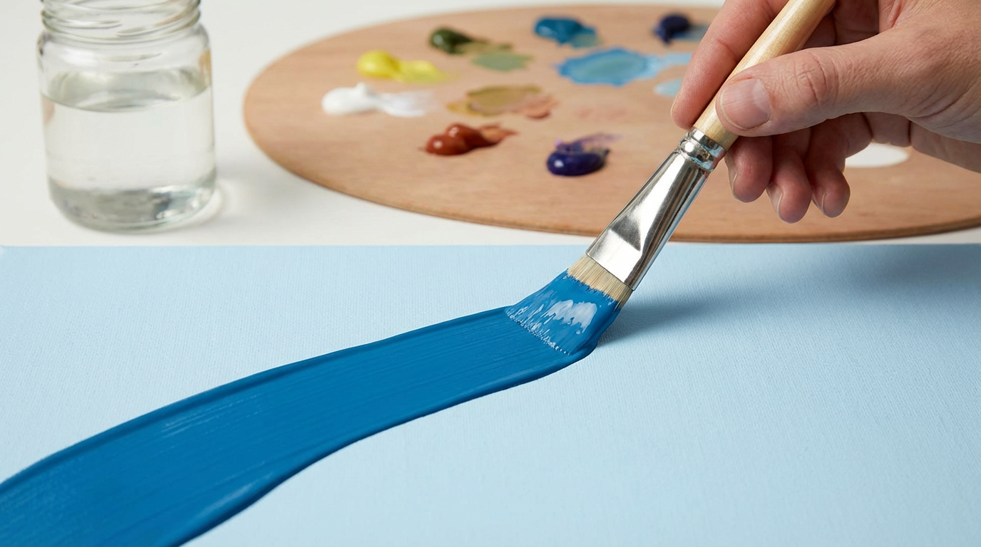
A helpful test involves watching how paint falls from a brush or palette knife. Thick paint clings and drops slowly. Medium paint forms a steady ribbon. Thin paint drips quickly and spreads on contact. These simple observations help you adjust before committing to the surface.
Another method involves the brush drag test. Pull the brush across your surface. If it skips, the paint is likely too thick. If it floods outward, thinning may have gone too far. Ideally, the brush should glide while still leaving intentional marks.
Paint Consistency Techniques for Detailed Brushwork
Fine detail demands control. For that reason, slightly thinned paint often works best. The goal is smooth flow without transparency unless glazing is intentional.
Paint should move easily off the brush tip. Still, it must not drip. Many artists describe this consistency as heavy cream. At this thickness, lines stay crisp while curves remain fluid.
Using paint straight from the tube usually causes resistance. Conversely, over-thinning weakens coverage. Therefore, add small amounts of water or medium gradually. Test often. Adjustments should feel subtle rather than dramatic.
This consistency suits line work, small shapes, and controlled blending. It also reduces hand fatigue during long sessions.
Choosing Consistency for Blending and Soft Transitions
Blending thrives on slightly looser paint. When the paint stays open longer, edges can be softened without harsh breaks. This approach works especially well in portraiture and atmospheric scenes.
Paint should still hold pigment strength. However, it must move easily when brushed into neighboring colors. Think of yogurt rather than cream. The paint spreads willingly but does not run.
Using too thick a mixture creates stubborn edges. Meanwhile, overly thin paint tends to lift underlying layers. Because of this, balance matters. Many painters adjust consistency directly on the canvas during blending to maintain control.
Paint Consistency Techniques for Texture and Impasto
Texture loves thickness. Heavy-bodied paint holds peaks, ridges, and knife marks beautifully. In this case, thinning should be minimal or avoided entirely.
Straight-from-the-tube paint works well here. Sometimes, additional body can be added using gels or modeling paste. These materials increase volume without weakening color strength.
Impasto techniques rely on physical presence. Light reflects differently across raised surfaces, adding depth. Thin paint simply cannot achieve this effect. Therefore, thickness becomes a creative tool rather than a limitation.
Using Thin Paint for Washes and Glazing
Thin paint behaves like a veil. It alters color underneath without hiding it. Glazing and washes depend on transparency and flow.
Paint consistency techniques for glazing involve significant thinning. The paint should spread effortlessly and settle smoothly. Watercolors naturally live in this space. Acrylics and oils require deliberate dilution.
Despite being thin, glaze mixtures should still contain enough binder. Otherwise, adhesion suffers. For acrylics, glazing medium works better than water alone. For oils, solvent and medium combinations help maintain integrity.
Patience becomes essential here. Thin layers dry quickly but require multiple passes. Each layer adds depth gradually.
Matching Paint Consistency to Surface Type
Surface absorbency plays a major role. A highly absorbent surface pulls moisture from the paint quickly. As a result, paint thickens on contact. Less absorbent surfaces allow paint to sit and move longer.
Canvas, wood panels, paper, and primed boards all respond differently. Because of this, the same paint mixture may behave unpredictably across surfaces. Adjustments should be made accordingly.
On absorbent surfaces, slightly thinner paint helps maintain flow. On slick surfaces, thicker mixtures prevent uncontrolled spreading. Observing how the first strokes behave tells you what adjustments are needed.
Adapting Consistency for Acrylic Paint
Acrylic paint dries fast. That reality shapes consistency choices. Thicker paint stays workable slightly longer. Thin paint dries almost immediately.
For most acrylic techniques, a medium-thick consistency offers balance. It allows blending while maintaining control. Retarding mediums can extend drying time without excessive thinning.
Water should be used carefully. Too much water weakens the paint film. Instead, acrylic mediums preserve strength while adjusting flow. Understanding this distinction improves results dramatically.
Adapting Consistency for Oil Paint
Oil paint offers more forgiveness. Drying time stretches generously, making consistency adjustments less urgent. Still, paint consistency techniques matter just as much.
Oil paint can be used thick for texture or thinned for smooth transitions. Solvents increase flow but reduce fat content. Mediums add both flow and richness.
Following the fat-over-lean principle ensures longevity. Thinner layers go first. Thicker, oil-rich layers follow. This structure prevents cracking and improves stability.
Adapting Consistency for Watercolor
Watercolor lives and breathes consistency. Small changes in water ratio create dramatically different effects. Therefore, constant testing becomes essential.
Dry brush techniques require minimal water. Washes need generous dilution. Timing also matters. Wet-on-wet behaves differently from wet-on-dry even at the same consistency.
Watercolor painters often mix multiple puddles. Each puddle holds a different thickness. This approach allows quick adjustments during painting without hesitation.
How to Test Paint Consistency Before Painting
Testing saves frustration. Simple tests prevent unwanted surprises. A scrap surface or palette paper works well.
Try pulling a line, laying a patch, or tapping the brush lightly. Watch how the paint settles. Notice how edges behave. These observations guide adjustments instantly.
Testing should feel routine rather than optional. Over time, the process becomes automatic. Your hands will recognize the right consistency almost instinctively.
Common Mistakes with Paint Consistency
Many beginners thin paint too aggressively. Coverage suffers, and colors look weak. Others avoid thinning entirely, leading to stiff, lifeless strokes.
Another mistake involves inconsistent mixtures. If each brushload varies, results become unpredictable. Mixing thoroughly prevents this issue.
Finally, ignoring surface response creates confusion. Paint consistency techniques must adapt to context. What works today may need adjustment tomorrow.
Developing Intuition Through Practice
Consistency awareness grows through repetition. Each painting teaches something new. Over time, you will adjust mixtures without measuring.
Pay attention to failures. Notice what felt wrong. Was the paint dragging? Was it flooding? These sensations guide improvement more than rules ever could.
Confidence comes from familiarity. Once you trust your ability to adjust on the fly, experimentation feels safe rather than risky.
Conclusion
Paint consistency techniques shape how ideas become visible. They influence control, texture, mood, and expression. When consistency aligns with technique, painting feels natural and responsive.
Rather than chasing perfect formulas, focus on observation and adjustment. Let the paint teach you how it wants to move. With time, choosing the right consistency becomes second nature. At that point, technique stops feeling technical and starts feeling expressive.
FAQ
1. How do I know if my paint is too thick?
If the brush drags, skips, or leaves unwanted texture, the paint is likely too thick.
2. Can I fix paint that is too thin?
Yes, you can add more paint or a thicker medium to restore body and coverage.
3. Is water always the best thinning option?
Not always. Mediums often maintain strength better, especially for acrylics and oils.
4. Should every technique use a different consistency?
Most techniques benefit from specific consistencies, although overlap does exist.
5. How long does it take to master paint consistency techniques?
Basic understanding develops quickly, but true intuition grows through regular practice.
Leave a Comment