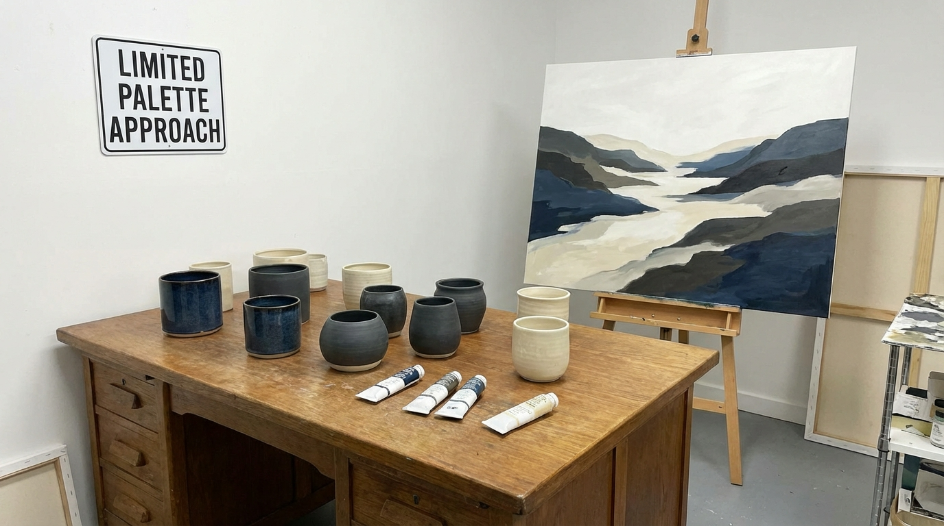
A limited palette approach can completely transform the way you paint. Instead of juggling countless colors, you focus on a small, intentional selection. As a result, harmony improves and your artistic voice becomes clearer.
When artists adopt a limited palette approach, they remove unnecessary complexity. Fewer colors create stronger relationships between tones. Consequently, paintings feel unified rather than chaotic.
Many great masters relied on restrained color systems. They understood that cohesion builds recognition. Therefore, learning to work with fewer hues can strengthen both technique and identity.
Why a Limited Palette Creates Stronger Harmony
Color harmony forms the foundation of visual appeal. However, too many hues often compete for attention.
With a reduced selection, colors naturally relate to one another. Because they share undertones, they blend more easily. This relationship creates visual flow across the canvas.
Additionally, fewer pigments simplify mixing. You gain better control over value shifts and saturation. Instead of correcting muddy combinations, you work with clarity and intention.
Another advantage involves emotional consistency. When you rely on a defined set of tones, mood remains stable throughout the composition. Viewers sense balance immediately.
Through repetition, your work begins to feel recognizable. That recognition develops because the limited palette approach reinforces harmony in every piece.
Choosing the Right Colors for Your Core Set
Selecting colors carefully is essential. Start with a warm and cool version of a primary hue. This pairing offers flexibility.
For example, choose one warm red and one cool blue. Add a yellow with strong mixing potential. Include white for highlights and possibly a dark neutral for depth.
However, avoid adding too many variations at once. Restraint strengthens results.
Consider your artistic goals as well. If you favor atmospheric landscapes, muted earth tones may serve you best. On the other hand, expressive abstracts might benefit from bold primaries.
When you align choices with personal strengths, the limited palette approach feels empowering rather than restrictive.
Strengthening Value Control Through Restriction
Value contrast often matters more than hue variety. Therefore, working with fewer colors sharpens your focus on light and dark relationships.
Because you mix tones manually, you develop a deeper understanding of color interaction. Shadows become intentional. Highlights gain clarity.
Moreover, restricting options forces problem-solving. Instead of reaching for a new tube, you adjust mixtures thoughtfully. This habit improves skill rapidly.
Over time, paintings gain depth without excessive saturation. Viewers notice structure before color complexity.
As you practice consistently, the limited palette approach trains your eye to prioritize value and balance.
Creating Visual Identity With Repetition
Style emerges through consistency. Therefore, repeating a similar tonal structure across multiple works builds identity.
When you return to the same core colors, patterns develop naturally. Subtle variations appear, yet the overall mood remains recognizable.
Artists known for distinct tonal atmospheres often rely on restricted systems. Their paintings feel connected even when subjects differ.
Additionally, galleries and collectors appreciate cohesion. A unified body of work communicates professionalism and intention.
By committing to a limited palette approach, you encourage stylistic clarity instead of visual confusion.
Avoiding Common Mistakes With Limited Colors
Although restriction offers benefits, certain mistakes can weaken results.
First, avoid choosing colors that clash in undertone. Even within a small set, harmony matters. Test combinations before committing to large projects.
Second, prevent monotony by adjusting value and texture. While hues remain consistent, contrast should still vary.
Third, maintain balance between warm and cool tones. Even subtle temperature shifts create depth and dimension.
If paintings feel flat, examine value range rather than adding new colors. Often, stronger light-dark contrast solves the issue.
Through mindful adjustment, the limited palette approach remains dynamic instead of repetitive.
Adapting the Approach Across Painting Mediums
Different mediums respond uniquely to color restriction. Oil paint blends gradually, allowing smooth transitions within a small range. Acrylic dries quickly, so pre-mixing becomes essential. Watercolor requires careful planning because corrections are limited.
However, the principle remains consistent across mediums. Fewer pigments create unity.
When switching materials, test your selected palette thoroughly. Observe how pigments interact under varying conditions.
Because each medium handles transparency and opacity differently, adjust mixing techniques accordingly. Yet keep your core tones consistent to maintain cohesion.
Enhancing Emotional Impact With Fewer Colors
Emotion often strengthens when color choices narrow. A restrained selection directs attention toward composition and storytelling.
For example, a cool-dominant palette can evoke calm or introspection. A warm-focused system may suggest energy or nostalgia.
When emotional tone remains steady, viewers connect more deeply.
Additionally, limited systems prevent distraction. Instead of scanning multiple hues, the eye moves smoothly across the canvas.
As emotional clarity increases, your paintings communicate more powerfully.
Expanding Creativity Through Constraint
Restriction might seem limiting at first. However, boundaries often spark innovation.
When you work within defined parameters, you explore texture, composition, and brushwork more deeply.
Instead of relying on color variety for interest, you experiment with layering, glazing, or bold strokes.
Furthermore, solving visual challenges with fewer tools strengthens technical confidence.
Over time, the limited palette approach becomes a catalyst for creative growth rather than a barrier.
Developing Long-Term Consistency
Consistency requires discipline. Therefore, create a structured plan for your color system.
Document your chosen hues and mixing ratios. Photograph completed works for comparison. Review progress regularly.
If adjustments feel necessary, introduce changes gradually. Sudden shifts can disrupt cohesion.
Because style evolves naturally, allow refinement while preserving core tones.
As years pass, subtle shifts may occur. Yet the foundation remains stable due to the limited palette approach guiding your decisions.
Building Recognition in Professional Spaces
Recognition depends on repetition and clarity. Collectors and viewers remember distinct tonal moods more easily than random variations.
Therefore, presenting a cohesive series enhances credibility. When multiple paintings share visual harmony, your brand strengthens.
Additionally, marketing materials and online galleries benefit from consistent color identity. Digital portfolios appear organized and intentional.
By embracing a limited palette approach, you communicate confidence and direction within professional settings.
Balancing Flexibility and Structure
While cohesion matters, flexibility still plays a role. Consider introducing seasonal or thematic variations within your established system.
For instance, adjust saturation slightly for a new series. However, maintain core hues to preserve unity.
Small refinements keep your work evolving without losing identity.
Ultimately, structure provides the framework, while subtle experimentation sustains freshness.
Conclusion: Simplicity Builds Strength
A limited palette approach simplifies decision-making while strengthening artistic identity. By reducing color variety, you enhance harmony, improve value control, and build consistency.
Through repetition and mindful experimentation, your paintings gain clarity and emotional depth. Rather than overwhelming viewers with excess, you guide them with intention.
When you commit to this method, style develops naturally. Confidence increases because every color choice supports your vision.
In the end, the limited palette approach proves that simplicity often creates the strongest and most cohesive painting style.
FAQ
- Why does working with fewer colors improve harmony?
Fewer hues naturally relate to each other, which creates smoother transitions and stronger visual unity. - Can beginners benefit from a restricted color system?
Yes. Limiting options helps beginners focus on value, contrast, and mixing skills more effectively. - How many colors should I include in a core set?
Most artists start with three to five primary hues plus white, adjusting gradually as needed. - Does this method limit creativity?
Not at all. Constraints often inspire deeper exploration of texture, composition, and technique. - Can I adjust my palette over time?
Absolutely. Gradual refinement keeps your style evolving while maintaining overall cohesion.
Leave a Comment