
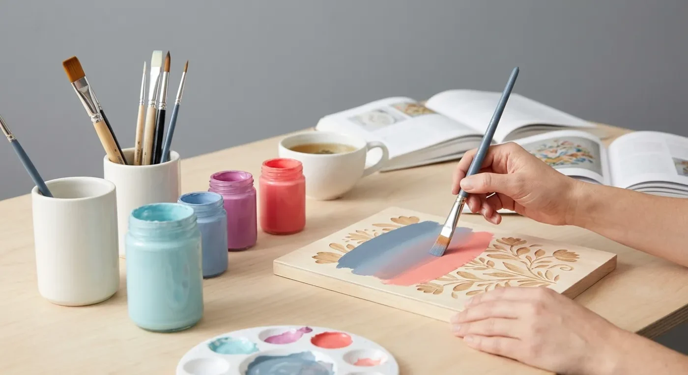

Adding depth and dimension to your decorative painting projects transforms them from beautiful to breathtaking. For hobbyist decorative painters and folk art enthusiasts, mastering realistic decorative shading is a skill that elevates your craft, making objects appear three-dimensional and vibrant. It’s not just about dark and light; rather, it’s about understanding how light interacts with form to create visual interest and a sense of realism.
Many painters start with flat colors, which are lovely. However, once you begin to explore shading, a whole new world of artistic expression opens up. This guide will walk you through foundational principles and practical techniques to achieve convincing shading, helping you build confidence and refine your artistic skills. Consequently, your folk art will gain remarkable depth.
Understanding Light and Shadow in Folk Art
Before picking up your brush, take a moment to observe light in the real world. Notice how light hits an object, creating bright highlights where it’s most direct, mid-tones where it’s softer, and shadows where it’s blocked. The key to successful shading is replicating this natural phenomenon on a two-dimensional surface.
In decorative and folk art, the goal isn’t always photographic realism. Instead, it’s a convincing illusion of depth that enhances the charm and character of your piece. Consider the classic folk art apple – a simple, round form. Without shading, it’s a flat circle. With proper shading, it becomes a luscious, ripe fruit you almost want to pick. Therefore, understanding light direction is paramount.
The Fundamentals of Value and Form
Value refers to the lightness or darkness of a color. It is the most important element when creating the illusion of three dimensions. A strong contrast in values makes an object appear solid and well-defined. Conversely, subtle shifts in value create a softer, more delicate form. Think about the spectrum from pure white to pure black, with many grays in between. Every color has a value, and recognizing this is crucial for effective shading.
Form, on the other hand, describes the three-dimensional quality of an object. While your canvas is flat, shading allows you to suggest that an apple is round, a leaf is curved, or a flower petal has depth. By carefully placing shadows and highlights, you can visually ‘mold’ your painted subjects. For example, a sphere will have a gradual transition from light to dark, whereas a cube will show sharper distinctions between its planes. This understanding is foundational for any artist aiming for dimensional painting.
Identifying Your Light Source
Establishing a consistent light source is perhaps the single most important decision in creating believable depth. Where is the light coming from? Is it directly overhead, from the side, or from below? Once you decide, all your highlights and shadows must align with this chosen direction. Inconsistency in light sources can make your painting look disjointed and flat. For instance, if light is coming from the top right, then shadows will generally fall to the bottom left. This consistency makes your folk art more cohesive and visually appealing.
Essential Tools and Materials for Realistic Decorative Shading
To begin your journey into advanced shading techniques, ensure you have the right tools. Having the correct materials makes a significant difference in the quality and ease of your shading work. Therefore, investing in good quality supplies is always recommended.
- Quality Brushes: A good round brush (size 4 or 6) is excellent for blending. A liner brush is ideal for fine details, and a flat brush works well for larger washes. Synthetic brushes are especially good for acrylics because they hold their shape and clean easily.
- Acrylic Paints: Choose a consistent brand for reliable color mixing and drying times. You’ll need your base color, a darker shade of that color (or a complementary dark like deep navy or burnt umber), and a lighter shade (or white/cream). Exploring advanced color mixing for folk art can further enhance your shading palette.
- Palette: A stay-wet palette is ideal for acrylics. It keeps your paints workable longer, which is crucial for smooth blending. You can also use a ceramic tile or a disposable palette, but a stay-wet option offers more flexibility.
- Water Basin and Paper Towels: These are essential for cleaning brushes thoroughly and controlling moisture, which is vital for proper paint consistency.
- Practice Surface: Wood, canvas, or even heavy paper are great for practicing your realistic decorative shading techniques. Start with simple shapes before moving to more complex designs.
Step-by-Step: Creating Depth with Realistic Decorative Shading
Let’s apply these principles to a common folk art motif: a simple leaf or petal. This approach can be adapted for any object. In fact, these steps form a solid foundation for most dimensional painting projects. Remember, patience and practice are key.
- Base Coat Application: Start by painting your object with its primary, mid-tone color. Apply two thin, even coats for good coverage. Let it dry completely. A solid base is crucial for subsequent layers.
- Identifying Light Source: Decide where your light source is coming from. This is crucial for consistent shadows and highlights. For a leaf, imagine light hitting from the top-left. Visualizing this early prevents errors later.
- Applying the First Shadow Layer: Mix a small amount of your darker shade with your mid-tone color, or use a pre-mixed darker shade. Load your brush with this darker mixture. Apply it to the areas of your leaf that would naturally be in shadow, opposite your light source. Blend the edges softly into the mid-tone. This initial shadow defines the basic form.
- Deepening Shadows: Once the first shadow layer is dry, you can deepen the shadows further. Use a pure dark color, or a darker mix, and apply it to the deepest parts of the shadow area. This adds more contrast and makes the form recede even more. Remember to blend smoothly.
- Adding Highlights: Now, load your brush with your lighter shade or pure white/cream. Apply this to the areas of the leaf that would directly catch the light, according to your chosen light source. These are your highlights. Blend the edges into the mid-tone. Highlights bring the form forward.
- Refining and Blending: The key to realistic decorative shading is seamless transitions. Use a clean, damp brush (or a blending brush) to gently soften any harsh lines between colors. Work quickly while the paint is still wet, or use a glazing medium to extend drying time. Continue to build up layers of light and dark until you are satisfied with the depth.
- Adding Cast Shadows: Don’t forget the shadow an object casts on the surface it rests upon. A cast shadow anchors the object to its environment and further enhances the illusion of depth. Cast shadows are usually darker and more defined closest to the object, then soften and lighten as they move away.
Advanced Techniques for Enhanced Depth
Once you’ve mastered the basics, consider these advanced techniques to bring even more life to your folk art. These methods will help you achieve more sophisticated and convincing dimension. Consequently, your artwork will truly stand out.
Glazing for Subtle Transitions
Glazing involves applying thin, translucent layers of paint over dried layers. This technique is excellent for creating incredibly smooth transitions between values and colors. Mix a small amount of paint with a glazing medium or water until it’s very transparent. Apply these thin layers gradually, building up color and value slowly. Each glaze deepens the tone without creating harsh lines, which is perfect for subtle realistic decorative shading. This method is particularly useful for achieving soft, ethereal effects.
Working with Complementary Colors for Dynamic Shadows
Instead of just adding black or a darker version of your base color, try using a complementary color to create more vibrant and interesting shadows. For example, if you’re painting a green leaf, try adding a touch of red or purple to your shadow mix. This creates a richer, more nuanced shadow that vibrates with color instead of looking muddy. Experiment with different complementary pairs to see the dynamic effects they produce. For more on this, consider exploring advanced color mixing.
Edge Shading and Highlighting
Pay close attention to the edges of your objects. A subtle dark line on the shadowed edge and a fine highlight on the lit edge can dramatically enhance an object’s crispness and separation from the background. This technique is often used in trompe l’oeil painting to create extreme realism. For instance, a thin, dark line can define the underside of a curled petal, while a fine, bright line highlights its upper edge. This is a crucial element of realistic decorative shading.
Texture and Impasto for Tactile Depth
While shading creates visual depth, adding actual texture can provide tactile depth. Use impasto techniques (applying thick paint) to build up areas that would naturally be raised, like the veins on a leaf or the rough skin of a fruit. This not only adds visual interest but also makes the object feel more real to the viewer. Combine this with proper shading, and the effect is truly stunning. For different surface ideas, consult how to paint different surfaces for decorative art.
Common Shading Mistakes to Avoid
Even experienced painters can fall into these traps. Being aware of them will help you refine your realistic decorative shading techniques.
- Muddy Colors: This often happens when mixing too many colors, especially when trying to create shadows with black. As a result, colors can lose their vibrancy. Instead, use complementary colors or a dark brown/blue for shadows.
- Inconsistent Light Source: As mentioned, a scattered light source makes a painting look unnatural. Always establish your light source at the beginning and stick to it.
- Lack of Contrast: If your painting looks flat, it’s likely due to insufficient contrast between your lightest highlights and darkest shadows. Don’t be afraid to go darker in the shadows and brighter in the highlights.
- Hard Edges Where They Shouldn’t Be: Not all edges are sharp. Soft blending is crucial for round or organic forms. Use a clean, damp brush or a blending medium to soften transitions.
- Ignoring Reflected Light: Light bounces! Even in shadowed areas, objects often pick up a subtle bit of light from surrounding surfaces. Adding a hint of reflected light can make your shadows appear less stark and more integrated.
Practice Makes Perfect: Exercises for Shading Mastery
To truly master realistic decorative shading, consistent practice is essential. Here are some exercises to help you build your skills.
- Shading Spheres and Cubes: Start with basic geometric shapes. Paint a series of spheres, each with a different light source. Then do the same for cubes. This helps you understand how light interacts with different forms.
- Monochromatic Studies: Choose one color and its values (from light to dark) to paint a simple object. This removes the complexity of color mixing, allowing you to focus purely on value and form.
- Nature Studies: Observe real objects in natural light – a piece of fruit, a stone, a leaf. Try to replicate the highlights, mid-tones, and shadows you see. This direct observation is invaluable.
- Photo References: Find high-contrast photos of objects and try to recreate their shading in paint. Pay attention to where the darkest darks and lightest lights are.
- Copying Master Folk Art Pieces: Study how traditional folk artists achieved depth. While their style might be stylized, many still employed effective shading techniques. For instance, consider how they rendered folds in clothing or the plumpness of a berry.
Remember, the goal is not just to copy but to understand the principles behind the realistic decorative shading. Over time, these exercises will build your visual vocabulary and technical proficiency. Furthermore, consistency in practice will yield significant improvements.
Integrating Shading into Your Overall Design
Shading is not an isolated technique; rather, it works in harmony with other elements of your painting. Consider how it interacts with composition, color, and texture. Effective shading can guide the viewer’s eye, create focal points, and enhance the narrative of your piece. For example, a brightly highlighted element will naturally draw attention. Conversely, a deeply shadowed area might suggest mystery or depth in the background. Understanding mastering layering techniques for depth in folk art can further complement your shading efforts.
Moreover, think about how shading contributes to the mood of your painting. Dramatic contrast can create a sense of intensity, while soft, subtle shading can evoke tranquility. By thoughtfully applying realistic decorative shading, you gain greater control over the emotional impact of your artwork. This holistic approach ensures that every element of your painting contributes to a cohesive and compelling final product.
Finally, consider how shading can be used to emphasize the unique charm and character of folk art. While not strictly photo-realistic, folk art often benefits from a convincing illusion of depth that makes its subjects feel more tangible and inviting. This balance between stylized forms and dimensional rendering is a hallmark of truly exceptional folk art.
Conclusion: Your Journey to Dimensional Painting
Mastering realistic decorative shading is a journey, not a destination. Each stroke, each blend, and each observation brings you closer to creating folk art that possesses remarkable depth and vitality. By understanding the interplay of light and shadow, practicing diligently, and experimenting with various techniques, you will undoubtedly elevate your decorative painting skills. Remember that every artist, regardless of skill level, continues to learn and grow. Embrace the process, enjoy the transformation your art undergoes, and celebrate each step forward. Your ability to create compelling, three-dimensional forms will not only enhance your work but also deepen your appreciation for the subtle nuances of light in the world around us. Keep painting, keep exploring, and let your creativity shine with newfound depth and realism!
For further inspiration and to connect with other artists, consider exploring reputable art resources online like The National Gallery of Art’s collection on understanding light in art or publications from Artists Network for more painting tips.
FAQ: Achieving Depth in Decorative Art
How do I make my paintings look less flat?
To add depth, focus on creating contrast using values (light and dark). Identify a consistent light source, then apply shadows to areas away from the light and highlights to areas directly hit by it. Blending these transitions smoothly will make your subjects appear three-dimensional.
What’s the best way to blend shadows in acrylics?
Blending in acrylics requires working quickly as the paint dries fast. Use a clean, damp brush to soften edges. You can also use a glazing medium to extend the paint’s open time, allowing for more seamless transitions between colors and values.
Should I use black for shadows?
While black can be used, it often results in muddy or dull shadows. Instead, try mixing a darker version of your base color, or use complementary colors (like a deep blue or burnt umber for warm colors) to create richer, more vibrant shadows. This approach adds more life to your painted forms.
How important is a consistent light source?
A consistent light source is paramount. It dictates where all your shadows and highlights fall, ensuring your painting looks cohesive and realistic. Without it, objects can appear disconnected or flat. Always decide on your light source before you begin painting.
Can these techniques be applied to all types of folk art?
Yes, the principles of light, shadow, and value are universal to creating depth in any art form. While folk art often has a stylized quality, applying these dimensional painting techniques will enhance its charm and make your subjects appear more robust and engaging, regardless of the specific style.
How do I practice dimensional painting without wasting supplies?
Start with simple exercises on inexpensive surfaces like heavy paper or practice boards. Focus on basic shapes like spheres and cubes using just one color and its values. This allows you to understand the principles of light and shadow without needing to use your best paints or canvases.