
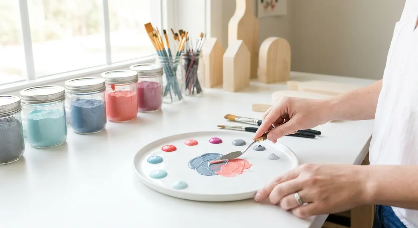

For every decorative painter, understanding decorative painting color mixing is the cornerstone of creating truly captivating and harmonious folk art pieces. It’s not just about picking colors from a tube; it’s about learning how to combine them to achieve precisely the shade, tone, and mood you envision. This guide will walk you through the essentials of color theory, helping you transform your palette into a vibrant spectrum of possibilities and give you the confidence to mix any hue your project demands.
Achieving beautiful and consistent colors is a skill that develops with practice. Furthermore, a solid grasp of how colors interact can elevate your artwork from good to exceptional. We will explore fundamental principles and practical tips, enabling you to approach your palette with newfound knowledge and creativity. Consequently, your folk art projects will feature richer, more intentional color schemes.
The Foundations of Color: Primary, Secondary, and Tertiary
At the heart of all color creation are the primary colors: red, yellow, and blue. These are the colors that cannot be created by mixing any others. From these, you can derive an infinite array of shades:
- Secondary Colors: Mix two primary colors, and you get a secondary color. For example, red and yellow make orange; yellow and blue make green; blue and red make purple.
- Tertiary Colors: Mix a primary color with an adjacent secondary color. Examples include red-orange, yellow-green, or blue-violet. These often have more nuanced names like ‘russet’ or ‘teal’.
Understanding this foundational structure allows you to systematically approach color creation, ensuring you can replicate specific shades or invent new ones with purpose. Indeed, mastering these basic relationships is crucial for any aspiring colorist in decorative arts. Moreover, this knowledge forms the basis for all further exploration into color harmony.
Warm vs. Cool Colors: Setting the Mood
Colors possess inherent temperatures that influence the feeling and depth of your decorative art. Warm colors (reds, oranges, yellows) tend to advance in a painting, evoking feelings of energy, warmth, and closeness. Conversely, cool colors (blues, greens, purples) recede, suggesting calmness, distance, and tranquility. By strategically incorporating both warm and cool tones, you can create visual interest, depth, and a sense of movement within your piece. For example, painting a warm-toned flower against a cool, muted background can make the flower pop with life. This contrast is a powerful tool in your artistic toolkit. Therefore, consider the emotional impact of your chosen palette.
Harnessing Complementary Colors for Impact
Complementary colors are pairs of colors that sit directly opposite each other on the color wheel (e.g., red and green, blue and orange, yellow and purple). When placed next to each other, they create a strong contrast that makes both colors appear more vibrant and intense. This high contrast is incredibly useful in folk art for drawing attention to specific details or creating dynamic compositions. However, use them judiciously; too much saturation of complementary colors can be overwhelming. A common approach is to use one as the dominant color and the other as an accent. This technique can add a lively spark without overdoing it. Furthermore, understanding how complementary colors interact is vital for effective color arrangements.
Achieving Perfect Custom Paint Shades with Decorative Painting Color Mixing
The real magic of decorative painting color mixing comes from creating custom shades. Here’s a simple process:
- Start with the Lighter Color: When mixing, always begin with the lighter color on your palette, then slowly add small amounts of the darker color until you reach your desired shade. This prevents waste and gives you more control.
- Mix Thoroughly: Ensure your colors are completely blended to avoid streaky results. Use a palette knife or brush to combine them until the color is uniform.
- Test on a Scrap Surface: Paint a small swatch on a piece of scrap paper or a hidden area of your project. This allows you to see how the color truly appears when dry, as paint often dries slightly darker or lighter.
- Adjust as Needed: If the color isn’t quite right, add more of a primary, secondary, or even a tiny amount of black or white to adjust the value. Remember, a little goes a long way, especially with darker pigments.
This systematic approach ensures you achieve the precise hues for your decorative art. In addition, it builds your confidence in experimenting with various pigment combinations. For more advanced techniques, consider exploring Unlock Vibrant Hues: Advanced Color Mixing for Folk Art.
Understanding Tints, Tones, and Shades
Expanding your understanding beyond basic color mixing involves exploring tints, tones, and shades. These variations add subtlety and richness to your palette:
- Tints: Created by adding white to a pure color. Tints lighten a color, making it softer and often more delicate. Think pastels.
- Shades: Created by adding black to a pure color. Shades darken a color, making it deeper and more intense.
- Tones: Created by adding grey (black + white) to a pure color. Tones desaturate a color, making it less vibrant but often more sophisticated and natural.
By mastering tints, tones, and shades, you can control the overall mood and depth of your artwork. For instance, a folk art piece using many soft tints might feel whimsical, while one with deep shades could convey a more dramatic atmosphere. This nuanced approach to color variation is key to sophisticated decorative art. Therefore, practice these adjustments regularly.
Color Schemes for Harmonious Decorative Art
Choosing an effective color scheme is crucial for creating visually appealing folk art. Here are some popular schemes derived from the color wheel:
- Monochromatic: Uses variations (tints, tones, and shades) of a single color. This creates a cohesive and calming effect.
- Analogous: Uses colors that are next to each other on the color wheel (e.g., blue, blue-green, green). These schemes are harmonious and pleasant to the eye, offering a smooth transition between hues.
- Triadic: Uses three colors equally spaced on the color wheel (e.g., red, yellow, blue). This scheme is vibrant and balanced, providing strong visual contrast while maintaining harmony.
- Split-Complementary: Uses a base color and the two colors adjacent to its complement. This offers the visual excitement of complementary colors but with less intensity, creating a more nuanced contrast.
Experimenting with these schemes will help you develop an intuitive sense of what works best for different projects. Moreover, understanding these frameworks provides a roadmap for successful color choices. For inspiration on contemporary aesthetics, review Current Decorative Art Trends: Warm Minimalism to Bold Colors.
Practical Tips for Effective Decorative Painting Color Mixing
Beyond theory, practical application is where your skills truly grow. Here are additional tips for successful decorative painting color mixing:
- Keep Your Palette Clean: A clean palette prevents accidental muddying of colors. Wipe it down regularly, especially between mixing different hues.
- Small Amounts First: Always start with a small amount of paint when mixing. You can always add more, but you can’t take it away. This minimizes waste and gives you better control over the final shade.
- Document Your Mixes: For custom colors you love, record the