
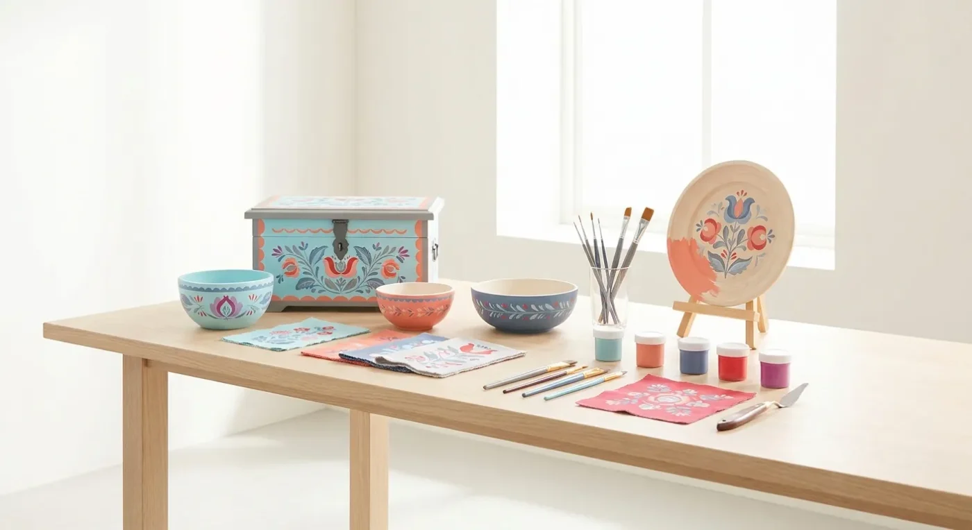

Choosing the right colors can dramatically impact the mood and authenticity of your decorative painting projects. Understanding folk art color palettes is essential for creating pieces that truly resonate with the spirit of this cherished art form. From the earthy tones of traditional designs to the brighter, more playful hues of contemporary interpretations, color choices are a powerful tool in your creative arsenal. Indeed, careful selection helps every stroke tell a story.
Exploring Traditional Folk Art Color Palettes
Historically, folk art often utilized pigments readily available. This led to palettes rich in natural, muted tones. Think deep forest greens, earthy browns, warm ochres, muted blues, and brick reds. These traditional folk art color palettes often convey a sense of heritage and groundedness. For instance, Pennsylvania Dutch folk art frequently features a limited yet striking array of colors, often incorporating black outlines for definition against a lighter background. Similarly, Scandinavian folk art, while also drawing from nature, might lean into softer blues, whites, and natural wood tones, accented with touches of brighter red or green. Embracing these historical palettes can give your work an authentic, time-honored feel, connecting it to generations of artists before you. Consequently, your pieces will possess a genuine connection to history.
Many early folk artists mixed their own paints from natural sources. Therefore, their color choices were often dictated by what was at hand. Berries, roots, and minerals provided a spectrum of earth tones. This resourcefulness defined the aesthetic of many regional styles. Consider the deep reds derived from iron oxides or the rich blues from indigo. These natural dyes and pigments created the characteristic subdued yet rich appearance of antique folk art. Moreover, understanding these origins helps us appreciate the simplicity and beauty of these historical color schemes. You can research more about traditional pigment sources to inspire your own work. For example, the Metropolitan Museum of Art’s Heilbrunn Timeline of Art History offers insights into American folk art.
Regional Inspirations for Your Painting
Different regions developed distinct approaches to color. Mexican folk art, for instance, bursts with vibrant hues. Think bright pinks, sunny yellows, and bold turquoises. These lively shades reflect the culture’s celebratory spirit. Conversely, early American Shaker folk art often favored a more restrained palette. Their pieces typically featured soft blues, grays, and natural wood finishes, reflecting their values of simplicity and utility. Studying these regional variations provides a wealth of inspiration. Furthermore, it helps you understand how cultural contexts shape artistic expression. You can adapt these traditional schemes to your own projects. Perhaps a vibrant Mexican-inspired bird or a serene Shaker-style box could be your next endeavor. This exploration truly enriches your artistic journey.
Modern Interpretations and Choosing Your Own Folk Art Color Palettes
While traditional palettes offer a strong foundation, contemporary folk art embraces a broader spectrum of colors. Modern folk artists might incorporate vibrant fuchsias, electric blues, or sunny yellows alongside more classic shades, adding a fresh, playful twist. When choosing your own folk art color palettes, consider the story you want your piece to tell and the overall feeling you wish to evoke. Do you want a piece that feels rustic and historic, or bright and whimsical? Experiment with a limited palette initially to ensure harmony, then gradually introduce accent colors to add interest. Don’t be afraid to try unexpected combinations; sometimes the most delightful discoveries happen outside the traditional boundaries. The key is to find colors that you love and that communicate your artistic vision effectively. Indeed, your personal touch is paramount.
Incorporating modern colors doesn’t mean abandoning the folk art spirit. Rather, it’s about evolving the tradition. For example, you might use a traditional design but execute it with a neon accent color. This juxtaposition creates a fresh, contemporary look while still honoring the art form’s roots. Many contemporary artists find joy in this creative tension. Consequently, they produce truly unique pieces. Consider the impact of a bright teal against a background of muted grays and browns. Such a choice can make a design pop with renewed energy. Therefore, experiment freely with your color choices to discover what resonates with your personal style. Your artistic voice will shine through these deliberate decisions.
Developing Your Unique Color Sense
Developing a keen eye for color harmony takes practice. Begin by observing the world around you. Notice how colors interact in nature, in textiles, or in architecture. Create a color journal where you record interesting combinations. Take photos of palettes that catch your eye. Over time, you’ll start to recognize patterns and develop an intuition for what works. Additionally, studying color theory can provide a solid framework. Understanding concepts like complementary, analogous, and triadic color schemes will empower your choices. For instance, complementary colors, like red and green, create high contrast and vibrancy when placed next to each other. Analogous colors, found side-by-side on the color wheel, offer a more harmonious, subtle effect. Learning these principles helps you make informed decisions, rather than just guessing. Color Wheel Pro offers a great resource for understanding basic color theory.
Practical Tips for Selecting Your Painting’s Hues
When starting a new project, it’s helpful to gather your potential colors before you begin painting. Lay out your paints and brushes. This allows you to visualize the palette as a whole. Consider creating small swatches on a piece of scrap paper. This helps you see how the colors look when dry, as some paints can change slightly in tone. Furthermore, think about the value of your colors – how light or dark they are. A good balance of light, medium, and dark values creates visual interest and depth. Without sufficient contrast, your painting might appear flat. Therefore, pay attention to both hue and value in your selections. This thoughtful approach ensures a more dynamic final piece.
Another excellent tip is to limit your initial palette. Starting with just three to five colors can actually foster greater creativity. It forces you to explore mixing and blending. You discover new shades from your limited selection. This process often leads to more cohesive and harmonious results. Once you’re comfortable with your core palette, you can gradually introduce an accent color or two. These accents should be used sparingly to draw attention to specific details. They provide a focal point without overwhelming the overall composition. Remember, less can often be more when it comes to color. A well-chosen, limited palette can be incredibly powerful.
The Role of Background and Contrast
The background color plays a crucial role in how your main design elements appear. A light background can make vibrant colors pop, while a dark background can add drama and intensity. Think about the overall mood you wish to achieve. For example, a muted cream background might enhance the antique feel of traditional folk art color palettes. Conversely, a bright white background could give a modern, crisp edge to contemporary designs. Contrast is also key. High contrast between elements creates visual excitement and helps distinguish shapes. Low contrast offers a softer, more subtle effect. By carefully considering your background and the contrast it provides, you can significantly enhance the impact of your decorative painting. Ultimately, these choices define the character of your finished work.
Infusing Personality with Folk Art Color Palettes
Your choice of folk art color palettes is a deeply personal expression. It reflects your taste, your mood, and the message you want to convey. Don’t be afraid to let your personality shine through. If you love bright, cheerful colors, incorporate them into your folk art. If you prefer a more subdued, earthy aesthetic, lean into those tones. There are no strict rules that dictate what
Explore more: More from Paint Works Mag