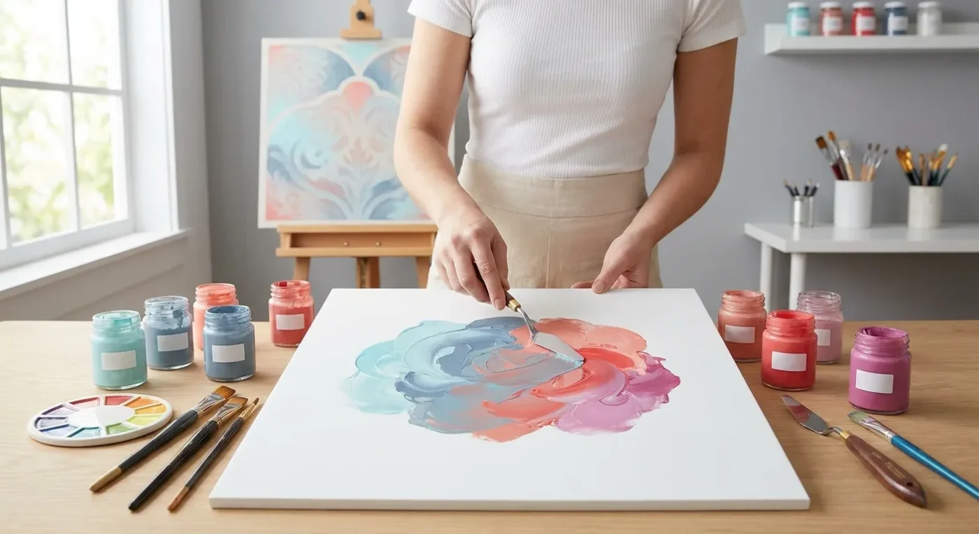

Moving beyond basic primaries and secondaries opens up a world of nuanced possibilities in your decorative painting. Advanced color mixing is a skill that empowers artists to create depth, mood, and harmony in their work, transforming a simple palette into a vibrant spectrum of subtle hues. It’s about understanding how colors interact and how to intentionally craft specific shades that elevate your artistic expression. Let’s delve into techniques that will refine your color sensibilities.
Unlocking Advanced Color Mixing Techniques
One key aspect of advanced color mixing is understanding tertiary colors and how to manipulate them. These are colors created by mixing a primary and a secondary color (e.g., red-orange, blue-green). Furthermore, focus on creating tints, shades, and tones. Tints are made by adding white, shades by adding black, and tones by adding grey. This allows for a vast array of variations from a limited set of base colors. Experiment with complementary colors – those opposite each other on the color wheel (e.g., red and green). Mixing small amounts of complements can create beautiful muted tones and rich browns, rather than just muddying your palette. Layering transparent glazes of different colors is another technique that creates luminous, complex colors that seem to glow from within, adding incredible depth to your decorative pieces. Consequently, mastering these foundational concepts is crucial for any artist looking to refine their approach to color.
Achieving Harmony and Depth with Sophisticated Color Blending
To achieve true harmony in your painting, consider using a limited palette. This forces you to mix all your desired colors from a few chosen tubes, ensuring inherent unity. Another strategy is to focus on color temperature. Warm colors (reds, oranges, yellows) tend to advance, while cool colors (blues, greens, purples) tend to recede. By consciously manipulating warm and cool tones, you can create the illusion of depth and dimension in your flat decorative surfaces. Don’t be afraid to keep a color journal or swatch book. Documenting your mixes and their ratios will build your intuitive understanding and allow you to recreate specific colors consistently. Practice is paramount; the more you experiment with advanced color mixing, the more confident and skilled you’ll become in orchestrating captivating palettes for your decorative art.
Embracing advanced color mixing techniques will profoundly impact the quality and sophistication of your decorative painting. By thoughtfully exploring the relationships between colors, you’ll gain the ability to infuse your art with richer detail and emotional resonance. Therefore, dedicating time to these practices is highly beneficial for artistic growth.
Understanding the Color Wheel: A Foundation for Blending Hues
A thorough understanding of the color wheel is fundamental to advanced color mixing. It visually represents the relationships between colors. Primary colors (red, yellow, blue) cannot be created by mixing other colors. Secondary colors (orange, green, violet) result from mixing two primaries. Tertiary colors, as mentioned, are combinations of a primary and a secondary. For instance, red-orange or blue-green. Knowing these relationships helps predict outcomes when combining pigments. Moreover, understanding analogous colors (next to each other on the wheel) and complementary colors (opposite each other) allows for intentional color choices that create either harmony or dynamic contrast. Experimenting with these relationships is a key step in developing your personal approach to color.
For example, using a split-complementary scheme, where you use a color and the two colors adjacent to its complement, can create vibrant yet balanced compositions. This is a more complex approach than simple complementary pairings, offering more visual interest. Similarly, a triadic color scheme, using three colors equally spaced on the color wheel, provides a bold and lively effect. Exploring these established color schemes can guide your initial experiments in sophisticated color blending. Further insights into color theory can be found on reputable art education sites, such as Color Matters, which offers extensive resources.
Creating Tints, Shades, and Tones: Expanding Your Palette’s Range
Beyond the basic hues, the ability to create tints, shades, and tones is essential for advanced color mixing. A tint is simply a color with white added. This lightens the hue and reduces its saturation, creating softer, more delicate versions of the original color. Consider painting a spring landscape; tints of green and blue would evoke a fresh, airy feeling. Conversely, a shade is a color with black added. This deepens the hue and makes it more intense or somber. Shades are excellent for creating dramatic shadows or a sense of mystery in a piece. For example, a deep red shade can convey a powerful, rich emotion.
A tone is created by adding grey to a pure hue. Grey mutes the color, reducing its intensity without making it lighter or darker in the way white or black would. Tones are incredibly useful for creating subtle variations and a more sophisticated, naturalistic feel in your decorative painting. They help to harmonize a palette and prevent colors from appearing too vibrant or artificial. By systematically exploring tints, shades, and tones for each color on your palette, you will dramatically expand your available range of expressions. This meticulous approach to advanced color mixing directly contributes to the overall visual richness of your artwork.
The Power of Glazing and Layering for Luminous Effects
Glazing is an advanced color mixing technique that involves applying thin, transparent layers of color over a dried base layer. Each glaze modifies the color beneath it, creating new optical mixtures. The light passes through the transparent layers, reflects off the white ground (or lighter base color), and then passes back through the layers to your eye, resulting in a luminous, glowing effect. This technique is particularly effective in decorative painting for creating depth, richness, and subtle color transitions that are difficult to achieve with opaque mixing alone. For example, a warm glaze over a cool color can create a vibrant, complex neutral.
When glazing, it’s important to use colors that are naturally transparent or to thin opaque colors with a glazing medium. Building up color gradually allows for greater control and prevents muddying. Think about how light filters through stained glass; glazing achieves a similar effect on your painted surface. This method of applying successive transparent washes allows for incredible depth and vibrancy. Mastering glazing is a hallmark of truly sophisticated color blending. Furthermore, it allows for corrections and adjustments as you build up your painting, making it a flexible and forgiving technique for achieving intricate color effects. If you’re looking to achieve seamless transitions in your folk art, understanding paint blending is crucial, and glazing can be a powerful tool, as explored in our article on Achieve Seamless Transitions: Mastering Smooth Paint Blending in Folk Art.
Limited Palettes: A Path to Cohesion in Color Schemes
Working with a limited palette might seem restrictive at first, but it is a powerful tool for achieving harmony and unity in your decorative painting. By selecting just a few primary or key colors, and then mixing all other desired hues from these, you ensure that every color in your painting shares a common lineage. This inherent connection between all the colors creates a cohesive and visually pleasing result. For instance, if you choose a warm red, a cool blue, and a warm yellow as your primaries, all your greens, purples, and oranges will have a subtle underlying warmth or coolness that ties them together.
A limited palette also forces you to become more adept at advanced color mixing. You learn to truly understand your pigments and how they interact, rather than relying on a vast array of pre-mixed tubes. This deepens your color knowledge and intuition. Consider the palettes of old masters, who often worked with a surprisingly small number of pigments. Their paintings demonstrate incredible richness and depth precisely because of the harmonious relationships created by a limited color set. Practicing with a limited palette is an excellent way to refine your understanding of color relationships and improve your overall painting skills. It encourages deliberate choices and thoughtful execution, which are vital for elevating your decorative art. You might also find inspiration for overcoming creative hurdles by exploring Reignite Your Muse: Strategies to Overcome Creative Blocks in Decorative Painting, as working with a limited palette can be a creative challenge in itself.
The Role of Color Temperature in Creating Illusion
Color temperature—the perceived warmth or coolness of a color—is another critical element in advanced color mixing. Warm colors (reds, oranges, yellows) tend to visually advance, meaning they appear closer to the viewer. Conversely, cool colors (blues, greens, purples) tend to recede, appearing further away. By consciously manipulating warm and cool tones within your decorative painting, you can create a powerful illusion of depth and dimension on a flat surface. Imagine a landscape where warm yellows and reds in the foreground draw the eye, while cooler blues and greens in the background suggest distance.
Even within a single color, there are variations in temperature. For example, a yellow-green is warmer than a blue-green. Understanding these subtle differences allows for nuanced effects. Using warmer tones in areas you want to highlight or bring forward, and cooler tones for areas you want to push back, is a foundational technique for creating spatial illusion. This thoughtful application of color temperature elevates a decorative piece from merely colorful to truly dimensional and engaging. It’s not just about what colors you use, but how their inherent temperature contributes to the overall visual story. Further exploration of color theory, including temperature, can be found at handprint.com, a comprehensive resource for artists.
Documenting Your Discoveries: The Value of a Color Journal
As you embark on your journey of advanced color mixing, keeping a color journal or swatch book becomes an invaluable practice. This isn’t just a record; it’s a learning tool that accelerates your understanding and intuition. Each time you mix a color you love, paint a swatch of it in your journal. Next to it, record the specific pigments you used and their approximate ratios. Note whether you added white, black, or grey, and in what proportion. Also, make a note of the intent or application for that particular mix – for example, “shadow for a red apple” or “background for a cool floral design.”
This documentation serves multiple purposes. Firstly, it allows you to recreate specific colors consistently, which is invaluable for larger projects or series of paintings. Secondly, by reviewing your journal, you begin to see patterns in how colors interact and how different pigments behave. This builds your intuitive understanding of color. Over time, your journal becomes a personalized reference guide, reflecting your unique color sensibilities and discoveries. It’s a tangible representation of your growth in advanced color mixing, and it fosters a deliberate, analytical approach to your artistic process. Many artists find this practice indispensable for their continued development, transforming trial and error into structured learning.
Practice and Experimentation: The Path to Mastery in Color Blending
Ultimately, proficiency in advanced color mixing comes down to consistent practice and fearless experimentation. Reading about color theory and techniques is a vital first step, but nothing replaces the hands-on experience of mixing pigments yourself. Dedicate regular time to simply playing with your paints, without the pressure of creating a finished piece. Try mixing every primary with every secondary, then every tertiary. See what happens when you add a tiny amount of a complementary color to a vibrant hue. What new colors emerge? How do they feel?
Don’t be afraid to make