
Ready to move beyond basic shades and truly make your folk art sing with vibrant, custom hues? Mastering advanced color mixing techniques is a fundamental step for any decorative painter looking to elevate their craft. This guide will help you understand the nuances of color theory, enabling you to create rich, expressive palettes that bring your unique vision to life. Indeed, by delving deeper into how colors interact, you can achieve remarkable depth and character in your decorative pieces. Furthermore, these skills are transferable across many artistic disciplines.
Understanding Color Temperature and Harmony
Beyond primary and secondary colors, understanding color temperature is crucial. Warm colors, such as reds, oranges, and yellows, tend to advance visually. Conversely, cool colors like blues, greens, and purples often recede. Therefore, experimenting with mixing warm and cool versions of the same color is highly beneficial. For instance, consider a warm red like cadmium red versus a cool red such as alizarin crimson. This subtle difference can dramatically impact the mood and depth of your painting. Consequently, your artwork will gain more dimension. Achieving color harmony means selecting colors that work well together. This can be accomplished through complementary, analogous, or triadic schemes. Don’t be afraid to use a color wheel as your best friend, exploring how different combinations interact and vibrate. Moreover, a good understanding of color relationships is foundational for any painter.
Exploring Complementary and Analogous Schemes
Complementary colors sit opposite each other on the color wheel, for example, red and green or blue and orange. When placed side-by-side, they create high contrast and visual excitement. However, when mixed, they can produce nuanced grays and browns. Analogous colors are found next to each other on the color wheel, such as blue, blue-green, and green. These schemes offer a sense of calm and unity, as they share a common hue. In fact, many folk art pieces utilize analogous palettes to create a harmonious and inviting feel. By contrast, triadic schemes involve three colors equally spaced on the color wheel, providing a vibrant and balanced look. Ultimately, the choice of scheme depends on the desired emotional impact of your artwork.
Crafting Custom Tones and Shades
To achieve truly unique results in advanced color mixing, focus on creating custom tones and shades. Tones are created by adding grey to a pure color. This reduces its intensity without making it darker or lighter. Shades are made by adding black, which deepens the color. Practice mixing your own greys using complementary colors, for example, blue and orange, rather than just using pre-mixed black and white. This approach will result in more nuanced, livelier grey tones. Experiment with adding a touch of a complementary color to mute a bright hue. This creates sophisticated, earthy shades, perfect for folk art’s rustic charm. Furthermore, understanding how to adjust value and intensity is key to developing a sophisticated palette. These techniques are essential for developing your skills. For more insights into creating harmonious palettes, consider reading about Crafting Vibrant Hues: Understanding Folk Art Color Palettes.
The Power of Tints and Earth Tones
Beyond tones and shades, tints are created by adding white to a pure color, making it lighter and softer. Integrating tints, tones, and shades allows for a vast spectrum of possibilities. Many folk artists cherish earth tones. These are often muted, natural colors like ochre, sienna, and umber. You can create your own rich earth tones by mixing primary colors with a touch of their complements and some white or black. For instance, a warm brown can be achieved by mixing red, yellow, and a tiny bit of blue. This process gives you greater control over your palette. Consequently, your art gains a unique signature. The ability to mix precise colors is a hallmark of skilled painters. It truly sets apart amateur work from professional pieces. Consider exploring the history of pigments for a deeper understanding of color origins and properties. A great resource for this is the Pigments Through the Ages website, which offers historical context and scientific details. This knowledge enriches your artistic practice.
Mastering Hue, Saturation, and Value
For truly next-level advanced color mixing, understanding hue, saturation, and value is indispensable. Hue refers to the pure color itself, like red, blue, or yellow. Saturation, also known as chroma, describes the intensity or purity of a color. A highly saturated color is vibrant and bright, while a desaturated color appears duller or grayer. Value, on the other hand, refers to the lightness or darkness of a color. A high-value color is light, while a low-value color is dark. By consciously manipulating these three elements, you gain complete control over your palette. For example, to make a color less saturated without changing its value, you can add a small amount of its complementary color or a neutral gray. To lighten a hue, add white; to darken it, add black or a darker complementary color. These adjustments are critical for creating depth and realism in your folk art. Furthermore, consistent practice with these concepts will refine your artistic eye. It develops a deeper appreciation for color. This ultimately improves your overall painting ability. Many artists find inspiration in historical decorative arts. You can learn more about this on various museum websites, such as The Metropolitan Museum of Art’s Decorative Arts collection. This can provide valuable insights into traditional color usage.
Creating Depth and Dimension with Color
Beyond simply mixing colors, consider how they interact to create depth. Colors that are warmer and more saturated tend to advance, appearing closer to the viewer. Conversely, cooler and more desaturated colors tend to recede, suggesting distance. This principle is fundamental in landscape painting but also applies beautifully to folk art, allowing you to create the illusion of three-dimensionality on a two-dimensional surface. For instance, if you are painting a folk art scene, use brighter, warmer colors for foreground elements and cooler, more muted tones for background details. This creates a sense of space and perspective. Additionally, varying the value of your colors is crucial for defining forms and shadows. A strong contrast in value can make an object pop, while subtle value shifts create smooth transitions. By consciously applying these techniques, your folk art pieces will gain a professional and polished appearance. This level of detail truly elevates your craft. It pushes you beyond simple flat designs.
Practical Exercises for Advanced Color Mixing
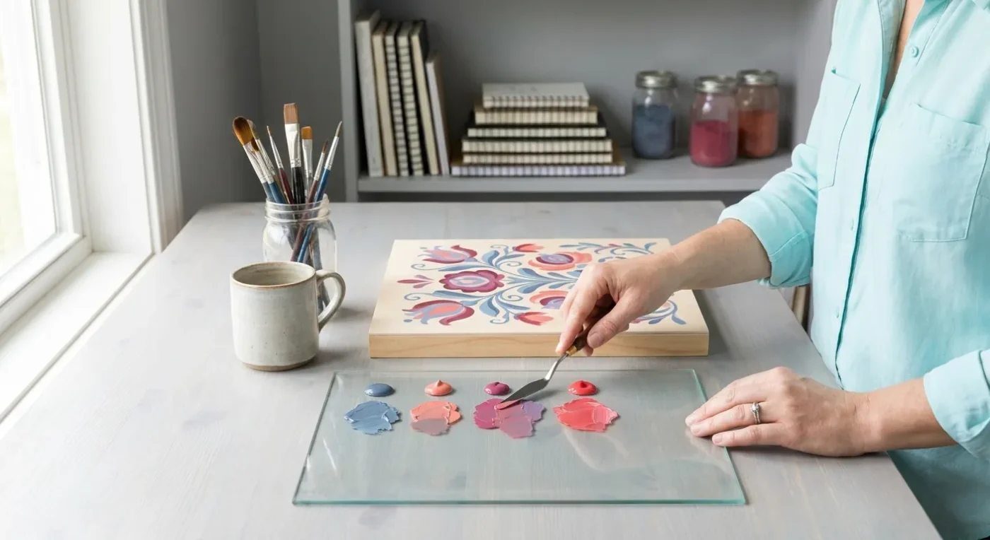
To truly master advanced color mixing, hands-on practice is essential. Start by creating a color chart for your specific paints. This involves mixing each of your primary colors with every other color in your palette, as well as with black and white. This exercise will give you a clear understanding of how your paints behave and what range of colors you can achieve. Next, try a monochromatic study. Pick one hue and paint an entire small piece using only that color, along with its tints, tones, and shades. This forces you to focus on value and saturation, rather than relying on a wide range of hues. Another valuable exercise is to create a limited palette painting. Choose just three or four colors and challenge yourself to mix every color needed for a small painting using only those selected hues. This pushes your creative boundaries and deepens your understanding of color relationships. These exercises are not just about mixing; they are about training your eye to see and interpret color more effectively. Consequently, your intuition for color will grow. Remember, consistent practice is the most direct path to mastery. For further guidance or to share your progress, feel free to contact us. We love hearing about your artistic journey.
Experimenting with Glazing and Layering
Glazing and layering are excellent techniques for achieving nuanced colors in advanced color mixing, particularly in folk art. Glazing involves applying thin, transparent layers of color over a dried base layer. This allows the underlying color to show through, creating luminous and complex optical mixes. For example, a thin glaze of blue over a yellow base will create a vibrant green that seems to glow. Layering, on the other hand, involves building up opaque or semi-opaque layers of paint, often with subtle shifts in hue, value, or saturation. This technique can add incredible depth and texture to your work. Moreover, it allows for corrections and refinements as you build your painting. Experiment with different levels of transparency by adding a medium to your paints. This will help you achieve the desired effect. The careful application of these techniques can transform a simple painting into a rich, multi-dimensional artwork. Therefore, don’t shy away from these methods. They are invaluable tools in your artistic repertoire. You can find more helpful resources and articles on our Blog.
Troubleshooting Common Color Mixing Challenges
Even with a solid understanding of color theory, painters often encounter challenges in advanced color mixing. One common issue is creating