
To truly make your folk art projects sing, mastering advanced folk art color blending techniques is essential for adding depth and dimension. While the foundational strokes provide the structure, it is the subtle interplay of color and light that breathes life into your decorative painting. This guide from PaintWorksMag will take you beyond basic color application, empowering you to create richer, more captivating folk art that stands out.
Why Advanced Blending Matters in Folk Art
Traditional folk art often features bold, clear colors. However, incorporating sophisticated color mixing can elevate your work from charming to truly exquisite. Blending allows you to:
- Create Dimension: Add shadows and highlights to make flat designs appear three-dimensional.
- Achieve Realism: While folk art is stylized, realistic shading can bring figures and flora to life.
- Enhance Visual Interest: Smooth transitions and varied tones keep the viewer’s eye engaged.
- Convey Mood: Different blending techniques can evoke different feelings, from soft antiquity to vibrant modernism.
Essential Tools for Superior Blending
Before diving into techniques, ensure you have the right tools:
- Quality Brushes: Soft, synthetic flat brushes (angular or straight) are excellent for smooth blends, while small round brushes help with subtle transitions in tight areas. A dedicated blending brush (often a soft, dry mop brush) can also be invaluable.
- Artist-Grade Acrylics: Higher pigment load in artist-grade paints allows for better coverage and richer color, crucial for effective blending.
- Retarder/Extender Medium: Acrylic paints dry quickly. A few drops of an acrylic retarder or blending medium will extend your working time, allowing for smoother transitions. This is a must for successful wet-on-wet blending.
- Palette: A non-absorbent, flat surface is best for mixing. A stay-wet palette can also significantly aid blending by keeping paints workable for longer.
Advanced Folk Art Color Blending Techniques
Let us explore key techniques that will add depth and nuance to your folk art.
1. Wet-on-Wet Blending
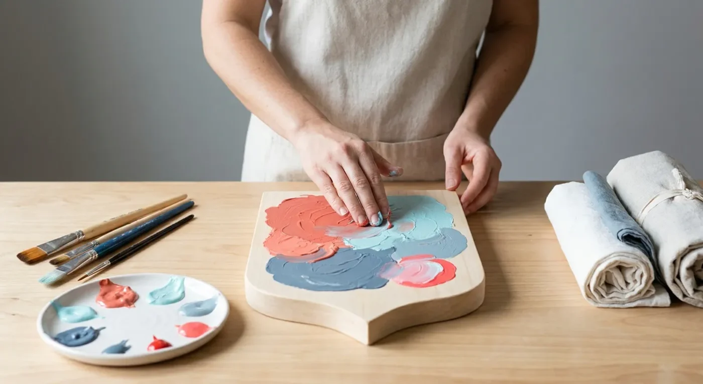
This technique involves applying wet paint onto another wet layer of paint, allowing the colors to softly merge on the surface. It is excellent for creating smooth gradients and soft transitions, particularly in backgrounds or large floral petals. For example, begin by moistening your surface slightly with a blending medium. This helps the paint glide more smoothly. Next, apply your first color generously. Then, immediately apply your second color adjacent to the first, ensuring a slight overlap. Finally, use a clean, dry brush to gently feather the meeting point until the transition is seamless. This method is particularly effective for large areas.
2. Dry Blending (Scumbling)
Dry blending, also known as scumbling, uses a minimal amount of paint on a dry brush. This technique is ideal for creating soft textures, subtle highlights, or adding a hazy effect. It is also excellent for softening edges or adding a weathered look to your folk art pieces. First, load a small amount of paint onto a dry brush. Then, offload most of the paint onto a paper towel until the brush is almost dry. Next, lightly scrub or scumble the brush over the desired area in small, circular motions. This builds up color gradually, creating a soft, diffused appearance. Consequently, this technique is perfect for creating natural textures like fur or aged wood.
3. Glazing for Depth and Luminosity
Glazing involves applying thin, transparent layers of color over a dried base coat. Each subsequent layer deepens the color and adds luminosity without obscuring the underlying details. This technique is truly transformative for achieving rich, jewel-like tones and profound depth. To begin, ensure your base layer of paint is completely dry. Then, mix a small amount of transparent paint with a glazing medium. Apply this thin, translucent mixture evenly over the area. Allow each glaze layer to dry completely before applying the next. You will find that multiple thin glazes create a much richer effect than one thick layer. For more detailed insights into this process, consider reading our article on Mastering Glazing Techniques: Achieve Luminous Depth in Decorative Art.
4. Feathering and Stroking
Feathering is a technique where you use light, delicate strokes to blend colors, often at the edges of shapes. It is particularly useful for creating soft gradients in petals or leaves. On the other hand, stroking involves applying paint with a consistent, directional movement to create smooth transitions. For feathering, load your brush with a small amount of paint and use the very tip of the bristles to make short, overlapping strokes that gradually lighten or darken an area. For stroking, apply two colors side-by-side. Then, using a clean, damp flat brush, make smooth, continuous strokes across the meeting point, pulling the colors into each other. Practice makes perfect with these methods.
5. Layering and Shading
Layering is fundamental to building depth. Start with a mid-tone color as your base. Once dry, apply darker shades in areas that would naturally be in shadow, such as under leaves or within folds. Subsequently, add lighter shades or highlights to areas exposed to light. This creates a strong contrast and makes objects appear more three-dimensional. For example, when painting a fruit, apply a base color. Then, add a darker shade to the underside. Finally, apply a tiny dot of a very light color for the highlight. This simple layering approach significantly enhances realism.
Mastering Color Theory for Advanced Blending
Understanding color theory is paramount for effective advanced folk art color blending. Knowing how colors interact will guide your choices and improve your results.
- Complementary Colors: Using small amounts of complementary colors (e.g., red and green, blue and orange) in shadows can create vibrant, yet subdued, depth.
- Analogous Colors: Blending analogous colors (colors next to each other on the color wheel, like blue, blue-green, and green) creates harmonious and smooth transitions.
- Warm and Cool Colors: Warm colors (reds, yellows, oranges) tend to advance, while cool colors (blues, greens, purples) tend to recede. Use this principle to create spatial depth in your compositions.
- Value: The lightness or darkness of a color is its value. Varying values within your blends is crucial for creating contrast and dimension.
Moreover, consider the overall mood you wish to convey. A vibrant piece might use more saturated colors, while a vintage-inspired design could benefit from muted tones and subtle blending. Experimentation with these principles will undoubtedly improve your blending skills.
Common Blending Challenges and Solutions
Even with the right tools and techniques, challenges can arise during advanced folk art color blending. Here are some common issues and their practical solutions:
- Muddy Colors: This often happens when you over-blend or use too many colors without proper consideration. Solution: Work quickly, use a clean brush for blending, and avoid mixing more than two or three colors at a time in a single blend. Furthermore, ensure your brush is not overloaded with paint.
- Hard Edges: If your blends look choppy or have distinct lines, you might be letting the paint dry too quickly. Solution: Use a retarder medium to extend drying time. Alternatively, try working in smaller sections. A soft, dry mop brush can also help soften hard edges after the paint has slightly set.
- Lack of Depth: If your blended areas still look flat, you might not be pushing the values enough. Solution: Be bolder with your darks and lights. Ensure there is a significant contrast between your darkest shadows and brightest highlights. Remember, subtle changes might not be enough to create true dimension.
- Brush Strokes Visible: This can detract from a smooth blend. Solution: Use soft, synthetic brushes. Work with thin layers of paint. Also, ensure your blending brush is clean and slightly damp, not overloaded with paint. Gentle, consistent pressure is key.
Practical Exercises for Improving Your Blending
Consistent practice is the most effective way to master advanced folk art color blending. Here are some exercises to help you hone your skills:
- Gradient Strips: On a practice surface, paint a series of strips, blending two or three colors from light to dark or vice versa. Focus on achieving seamless transitions. This builds muscle memory and control.
- Sphere Shading: Paint a simple circle and practice shading it to look like a three-dimensional sphere using your blending techniques. Observe how light falls on a real sphere for reference.
- Petal Blending: Folk art often features flowers. Practice blending colors on individual petals, creating highlights and shadows to give them a natural curve and depth. This is a fantastic way to apply your new skills.
- Background Washes: Experiment with wet-on-wet blending for creating soft, atmospheric backgrounds. Try different color combinations to see how they interact.
These exercises will not only improve your technical abilities but also enhance your understanding of color and light. Moreover, they provide a low-pressure environment to experiment without fear of ruining a larger project.
Integrating Advanced Blending into Your Folk Art Projects
Once you are comfortable with these advanced folk art color blending techniques, begin integrating them into your actual projects. Start with smaller elements or backgrounds before tackling larger, more complex designs. For example, when painting a floral motif, use wet-on-wet blending for the petals, then add subtle dry blending for texture on the leaves. Use glazing to add a rich, aged patina to a piece of furniture you are upcycling. For more ideas on transforming objects, see our guide, From Drab to Fab: Upcycling Everyday Objects with Decorative Paint. This gradual integration allows you to build confidence and see the profound impact these techniques have on your work.
Remember, folk art is about expression. While techniques are important, allow your creativity to shine through. The goal of advanced folk art color blending is to enhance your artistic vision, not restrict it. Feel free to adapt these methods to suit your unique style. Practice regularly, and you will soon notice a significant improvement in the depth and appeal of your decorative paintings.
Conclusion
Mastering advanced folk art color blending techniques truly opens up a new realm of possibilities for your decorative painting. By understanding and applying wet-on-wet, dry blending, glazing, feathering, and layering, you can transform flat designs into vibrant, dimensional works of art. Remember the importance of quality tools and a solid grasp of color theory. With consistent practice and a willingness to experiment, you will undoubtedly elevate your folk art to new heights, creating pieces that captivate and inspire. Keep exploring, keep creating, and let your colors truly sing!
For further inspiration and more painting advice, be sure to check out the PaintWorksMag Blog.
FAQ
What is the best way to start learning advanced blending?
Begin by practicing basic gradients and simple shapes on a scrap surface. Focus on achieving smooth transitions between two colors using wet-on-wet or dry blending. Gradually introduce more complex shapes and colors as your confidence grows.
How do I prevent my acrylics from drying too fast when blending?
To prevent quick drying, use an acrylic retarder or blending medium. Mix a small amount into your paints on the palette. Additionally, working on a stay-wet palette can significantly extend your working time. You can also lightly mist your surface with water.
Can these advanced color mixing techniques be used with oil paints?
While the principles of color mixing and layering are universal, the specific application techniques will differ. Oil paints have a much longer drying time, allowing for more extended wet-on-wet blending. However, the concepts of glazing and building depth remain relevant for both mediums. Further research into oil painting techniques would be beneficial.
What kind of brushes are best for achieving smooth color transitions?
Soft, synthetic brushes are generally best for smooth transitions. Flat brushes (angular or straight) are excellent for blending larger areas, while smaller round brushes work well for detail. A dedicated soft mop brush is also very effective for softening edges and creating seamless blends.
How often should I practice to see improvement in my decorative painting blending?
Consistent practice is key. Even short, regular sessions (e.g., 15-30 minutes a few times a week) are more effective than infrequent, long sessions. Focus on specific techniques during each practice session. Over time, you will notice significant improvement in your control and the quality of your blends.