
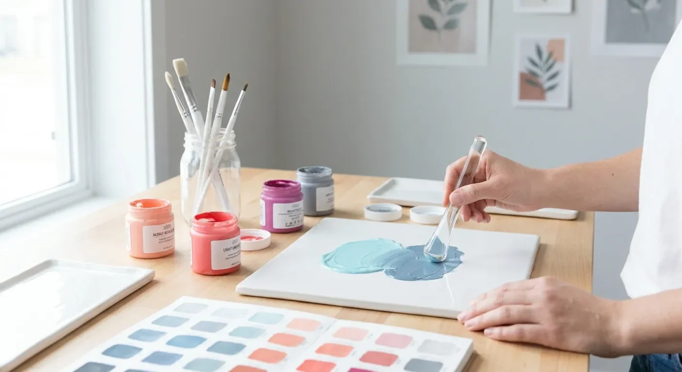

Understanding simple color mixing techniques is a fundamental skill that transforms your decorative painting projects from good to truly unique. While pre-mixed paints offer convenience, knowing how to blend your own custom hues opens up a world of creative possibilities, allowing you to achieve the exact shades you envision. At Paint Works Mag, we believe that empowering you with such knowledge builds confidence and adds a personal touch to every piece you create. This guide will walk you through the essentials, helping you master the art of creating your perfect decorative palette.
The Magic of Primary Colors
At the heart of all color mixing are the three primary colors: red, blue, and yellow. These colors cannot be created by mixing other colors, but they are the building blocks for every other shade. By mastering their combination, you unlock an infinite palette. For instance, think of how a traditional folk art piece often uses vibrant primary colors as its base. Learning to work with these foundational hues is the first step toward developing your unique artistic voice.
Indeed, understanding primary colors is crucial. Consider a color wheel; red, blue, and yellow are spaced equidistant, forming the core of all color theory. Many artists start with a limited palette of these three plus white and black, discovering the vast range of colors they can create. This approach not only saves money on supplies but also deepens your understanding of color relationships.
Secondary Colors: Your First Blends
When you mix two primary colors, you create a secondary color:
- Red + Yellow = Orange
- Yellow + Blue = Green
- Blue + Red = Violet (or Purple)
Experiment with different ratios of primary colors to get variations. For example, more yellow with blue makes a lime green, while more blue creates a darker forest green. These decorative art palette variations add richness to your work. Moreover, adjusting the proportions allows for an endless spectrum of oranges, greens, and violets, each with its own character. You can create a muted olive green for a rustic feel or a bright, cheerful orange for a bold design. Therefore, practice is key to developing an intuitive sense for these blends.
To illustrate, imagine painting a nature scene. A vibrant yellow-green might depict fresh spring leaves, while a deeper blue-green could represent the shadows in a forest. These subtle shifts in secondary colors can bring your artwork to life. Furthermore, understanding these blends helps when you want to tone down a color or make it more vivid. For more advanced explorations, consider how these secondary hues interact in complex compositions.
Tertiary Colors: The Next Layer of Complexity
Tertiary colors are created by mixing a primary color with an adjacent secondary color. They often have hyphenated names:
- Red-Orange
- Yellow-Orange
- Yellow-Green
- Blue-Green
- Blue-Violet
- Red-Violet
These colors bridge the gap between primaries and secondaries, offering subtle and sophisticated shades for your projects. Consequently, they add depth and nuance that can elevate your decorative painting. Think of the rich, earthy tones found in historical folk art patterns; many of these rely on well-blended tertiary colors. For example, a yellow-green can be perfect for depicting aged patina on a painted surface. By exploring these nuanced shades, you can create more complex and engaging visual narratives.
Furthermore, tertiary colors are excellent for creating harmonious palettes. They provide a smooth transition between the bolder primary and secondary hues. For instance, if you are working with a blue and an orange, a blue-violet or red-orange can help to unite the composition. Many decorative artists use these colors to add realism and complexity to their work, especially when depicting natural elements or intricate designs. Developing proficiency with these blends is a significant step in your artistic journey.
Understanding Warm and Cool Colors
Colors have temperatures, and understanding them can dramatically impact the mood of your painting:
- Warm Colors: Reds, oranges, and yellows. These colors tend to advance, bringing energy and warmth to a piece.
- Cool Colors: Blues, greens, and violets. These colors tend to recede, creating a sense of calm and distance.
Using a balance of warm and cool tones, or purposefully leaning into one, can create depth and emotion in your decorative painting. For instance, a folk art piece with warm ochre and terracotta colors might feel cozy and inviting, while one with cool sky blue and deep forest green might feel serene. Therefore, consider the emotional impact you wish to convey when selecting your palette. This aspect of color theory is fundamental to creating impactful artwork.
Moreover, the interplay of warm and cool colors can create a sense of three-dimensionality on a flat surface. Warm colors appear closer, while cool colors appear farther away. This technique is particularly useful in decorative painting for creating illusions of depth and perspective. A Rosemaling design, for example, often utilizes both warm and cool elements to create its characteristic flow and balance. Ultimately, mastering this distinction enhances your ability to guide the viewer’s eye through your composition.
Mixing Grays and Browns: Beyond the Basics
Many beginners struggle with creating natural-looking grays and browns without them appearing muddy. Here are some beginner color theory tips:
- Mixing Gray: Instead of black and white, try mixing complementary colors (colors opposite each other on the color wheel, like red and green, or blue and orange). A touch of white will lighten the resulting neutral gray.
- Mixing Brown: Mix all three primary colors together, adjusting the ratios until you achieve your desired brown. Adding more red or yellow will create warmer browns, while more blue will lean towards cooler, earthy tones.
These techniques help you achieve sophisticated neutral tones that are far more interesting than simply using black and white straight from the tube. In fact, a truly rich brown or a nuanced gray can provide a beautiful backdrop or subtle detail in your decorative art. For example, a warm brown can be ideal for painting wood grain, while a cool gray might be perfect for subtle shadows. Learning these advanced mixing strategies will undoubtedly improve your overall palette.
Furthermore, understanding how to mix these neutrals is essential for creating shadows and highlights that feel organic. A common decorative painting blunder is using pure black for shadows, which can make a piece look flat. Instead, a custom-mixed dark brown or gray offers a much softer and more integrated shadow. To learn more about avoiding common pitfalls, you might find our guide on Common Decorative Painting Blunders and How to Fix Them particularly helpful. These simple color mixing techniques for neutrals are vital for adding realism.
Understanding Color Value and Saturation
Beyond hue (the color itself), value and saturation are critical components of your decorative palette. Value refers to how light or dark a color is, while saturation describes its intensity or purity.
- Value: Adding white lightens a color, creating a tint. Adding black darkens a color, creating a shade. Adding gray or a complementary color creates a tone, which is a muted version of the original color.
- Saturation: A highly saturated color is vibrant and pure, while a desaturated color is duller and closer to gray. You can desaturate a color by adding its complement or a neutral gray.
By manipulating value and saturation, you can create visual interest and depth. For instance, using a range of values from light tints to deep shades can give a flat object a three-dimensional appearance. Similarly, varying saturation can draw attention to focal points in your artwork. These simple color mixing techniques extend beyond just hue, allowing for greater control over your final piece.
In addition, understanding value is crucial for planning your composition. A strong value contrast can create drama, while subtle value shifts can create a sense of calm. Many folk art styles, such as Rosemaling, rely heavily on variations in value to create intricate patterns and depth. For those interested in advanced techniques, exploring Advanced Folk Art Color Blending Techniques for Depth can further enhance your understanding of these concepts. Mastering value and saturation will undoubtedly elevate your decorative painting.
The Importance of a Limited Palette
While an infinite array of colors is exciting, sometimes working with a limited palette can actually boost your creativity and improve your understanding of color relationships. By intentionally restricting your choices, you’re forced to get creative with your simple color mixing techniques. This approach often leads to more harmonious and cohesive artworks.
For example, you might choose to work with just three primary colors plus white. From these few tubes of paint, you can mix a surprising number of secondary, tertiary, and neutral shades. This practice also helps you truly understand how each color influences another. Moreover, a limited palette is often more manageable for beginners, reducing overwhelm and encouraging focused experimentation. Many traditional folk art styles inherently use a limited color range, resulting in their distinctive and charming aesthetics.
Practical Tips for Effective Color Blending
Now that you understand the theory, let’s look at some practical tips for applying your simple color mixing techniques:
- Start Small: Always mix a small amount first. You can always add more paint, but it’s hard to remove it.
- Use a Palette Knife: A palette knife helps you mix colors thoroughly without incorporating too much air, which can happen with a brush.
- Test on a Scrap: Before applying your custom color to your project, test it on a scrap piece of paper or canvas. Colors can look different when wet or dry, or on different surfaces.
- Keep Notes: If you create a custom color you love, write down the ratios you used. This will help you recreate it later.
- Clean Your Tools: Always clean your brushes and palette knife thoroughly between colors to avoid muddying your blends.
These practical steps ensure that your color mixing process is efficient and yields consistent results. Consequently, you will build confidence and avoid frustration. Remember, practice makes perfect, and every mixing session is an opportunity to learn something new about your paints. Furthermore, consider experimenting with different paint mediums to achieve various effects, as discussed in Unlocking New Effects: A Guide to Acrylic Paint Mediums.
Creating a Cohesive Decorative Palette
Beyond individual color blends, creating a cohesive decorative palette for an entire project is essential for a harmonious result. Think about the overall mood or theme you want to convey. For example, if you’re painting Folk Art Coasters, you might want a bright, cheerful palette. For a more sophisticated piece, perhaps a muted, earthy selection.
Consider using analogous colors (colors next to each other on the color wheel) for a harmonious and calming effect. Alternatively, complementary colors (opposite on the wheel) provide high contrast and visual energy. A monochromatic palette, using various tints, shades, and tones of a single color, can also be incredibly elegant. By consciously selecting your palette, you ensure that all elements of your decorative painting work together seamlessly. This thoughtful approach transforms your work from merely painted to truly designed.
The Joy of Personalization Through Color
Ultimately, mastering simple color mixing techniques empowers you to inject your unique personality into every decorative painting project. No longer are you limited to the colors available in tubes; you become the creator of your own vibrant world. This ability to customize and personalize your palette is incredibly rewarding. It allows you to match colors perfectly to your home decor, to a specific inspiration, or simply to your mood.
Moreover, the process of mixing colors is a meditative and enjoyable part of the artistic journey. It connects you more deeply with your materials and your creative vision. As you gain experience, you’ll develop an intuitive sense for color, making your painting process more fluid and expressive. Embrace the experimentation, celebrate the discoveries, and enjoy the satisfaction of creating truly unique hues for your decorative art. This fundamental skill truly enriches your entire painting experience.
Conclusion
Mastering simple color mixing techniques is an invaluable asset for any decorative artist. From understanding the basics of primary and secondary colors to exploring the nuances of tertiary blends, warm and cool tones, and effective neutral mixing, you now have the tools to create any shade you desire. Remember to practice regularly, experiment boldly, and keep notes on your favorite custom hues. With these skills, your decorative painting projects will not only be more vibrant and personalized but also reflect a deeper understanding and appreciation for the art of color. So, grab your paints, a palette, and start mixing your way to a perfect decorative palette!
FAQ
How do I make my mixed colors less muddy?
To avoid muddy colors, always start with clean brushes and a clean palette. Also, be careful not to overmix too many colors together, especially primaries, unless you are intentionally trying to create a brown or gray. Using a complementary color to neutralize a hue, rather than just adding black, often yields cleaner results.
What are the essential colors every beginner painter should have?
For beginners, it’s highly recommended to start with a basic set of primary colors: Cadmium Red (or Alizarin Crimson), Ultramarine Blue (or Phthalo Blue), and Cadmium Yellow (or Lemon Yellow). Adding Titanium White and Mars Black will give you a solid foundation for countless custom color creations.
Can I mix different brands of paint together?
Generally, yes, you can mix different brands of the same type of paint (e.g., acrylic with acrylic, oil with oil). However, be aware that consistency, drying times, and pigment load can vary between brands, which might affect your final blend. Always test a small amount first to ensure compatibility.
How do I create pastel versions of colors?
To create pastel versions, simply add white paint to your chosen color. The more white you add, the lighter and more desaturated the color will become, resulting in a softer, pastel hue. Experiment with different ratios to achieve your desired lightness.
What is the best way to practice color blending?
The best way to practice is by creating color charts. Take your primary colors and systematically mix them to create all the secondary and tertiary colors. Then, add white or black to create tints and shades. This hands-on exercise is invaluable for building your understanding and intuition for color relationships and blending.
Why is understanding color temperature important in decorative art?
Understanding color temperature helps you control the mood and depth of your decorative art. Warm colors advance and create energy, while cool colors recede and evoke calm. By strategically using warm and cool tones, you can make elements appear closer or further away, add dimension, and create a specific emotional impact in your piece.